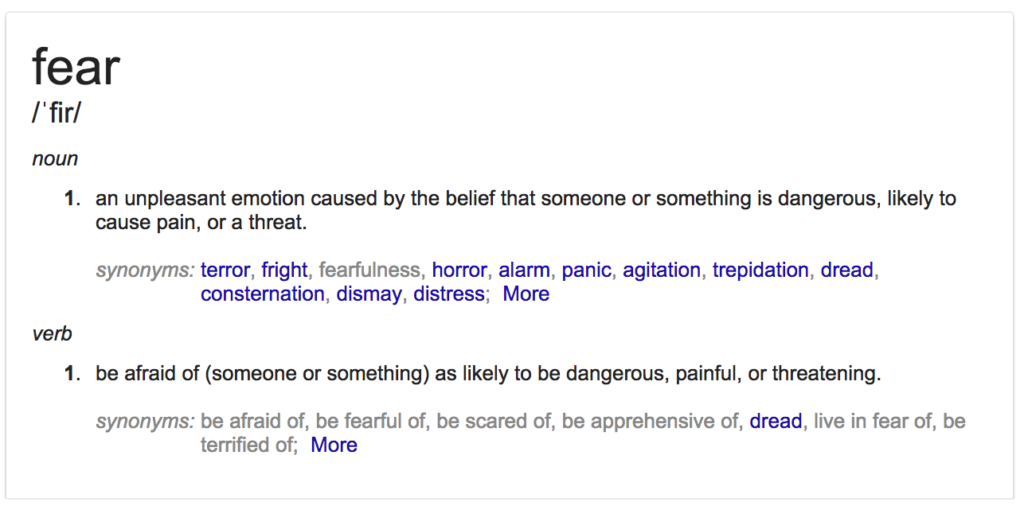
Perseverance


Working Together

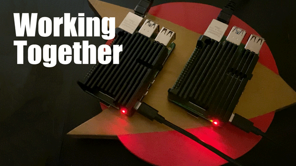
Two Raspberry Pi 4Bs running Rossetta@Home to fight COVID-19  (GIF by @aforgrave)

We are now eight weeks since the arrival of the pandemic and the shelter-at-home orders hit Ontario. Over the past 56 odd days, my daily efforts have been devoted to three “pandemic response” areas:

  1. my “day job,” supporting the delivery of webinars teaching kids the principles of coding, AI, and computational thinking — 102 webinars and counting; 
  2. my “volunteer job” as president of the Educational Computing Organization of Ontario (ECOO);
  3. a little side project, contributing to the “folding@home” and “rosetta@home” wide-scale distributed computing endeavours as they seek to understand various diseases like cancers, and the current scourge — COVID-19. 

In what might have been a fairly boring time to be recently retired and housebound, all three of these endeavours have allowed me to contribute, and, most importantly, have given me the daily opportunity to collaborate and work together with other folks. 

In the case of the day job, everyone got the “work from home” order on Friday March 13th, and since then, the days have been mediated by Zoom, Meet, and Slack calls, along with emails, slack chats, and lots of shared Google docs, spreadsheets, and presentations. In my case, I was already working from home, so that aspect of things didn’t change dramatically for me, but the nature of our communications now during work is mediated by an overarching sense of “all in this together,” and reflects a significant pivot from a face-to-face model to a completely online delivery model. Whether folks are in Montreal, Ottawa, Toronto, Winnipeg, Calgary, Edmonton, Vancouver, (or Belleville 🙂 ) this has worked because everyone is collaborating and working together to support the common cause. The daily fifteen minute online “breathe-breaks” during the noon hour are a great opportunity to take a brief pause together and reflect on the importance of wellness. Thanks to colleagues Maddy, Rita, Mavis, Matt, Gabrielle, Martin, German, Peter, Maia, La Donna, Maria, Maddie, Simon, and all the rest. 

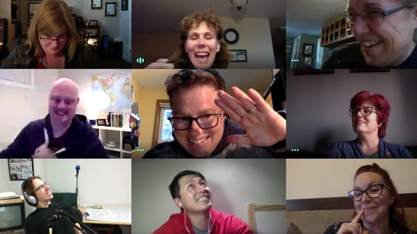
The ECOO Board of Directors during the May 4th Board Meeting (capture by @aforgrave)

Similarly, the ECOO Board of Directors responded to the arrival of the pandemic with an acknowledgement that our annual conference, Bring IT, Together (#BIT20) was likely in jeopardy, along with the regional #ECOOcamp events that were in the planning stages for the summer months. The Board collaborated in short order to develop a pandemic response plan, resulting in a number of us working long hours to revise the content on the ECOO.org website to support the current reality facing Ontario educators — teaching students at home, from home. Again, the importance of personal wellness and balance has been key, reflected on the landing page of the website and as part of our online meetings. Kudos to the members of the ECOO Board for the very positive and supportive get-togethers that have occured in recent months. BIG thanks to Mary, Lynn, Jen, Adele, Mel, David, Elias, Jason, and Ramona

Recent updates to ECOO.org include learn-from-home Resources, Podcasts, and webinar Events.

The last project — clustered under the #OntarioEducatorsUnited hashtag — started with a simple tweet exchange and has grown now to include a good number of Ontario Educators.  Just as the combined work of our group has resulted in the completion of over 2000 work units of computational support in the modelling of protein folding, that contribution works together with all of the other teams that feed into the project headquarters where the research teams analyse the data models in the effort to understand the coronavirus. Congrats to our team for reaching another milestone — shout out to Jim, Tim, Alanna, Max, Brock, Frank, Jen and Jen, Cal, and Erin. (If you’re interested in joining the team, we’d love to have you! Details are in the post Your Computer can fight COVID-19.)

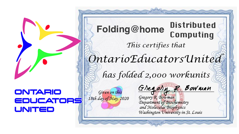
The #OntarioEducatorsUnited Team reached the milestone of 2000 work units on May 18th, 2020.

In recent days I’ve also got a couple of Raspberry Pi4s contributing to a separate Fold for Covid project. You might also want to join in on that, too.) 

Join the fight against COVID-19. Get your pin on the map!

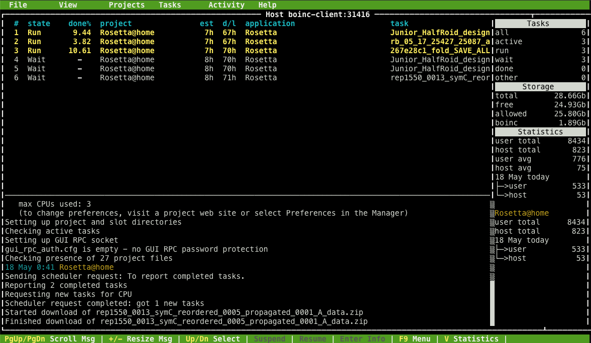
Rosetta@Home running on Raspberry Pi 4B  (capture by @aforgrave)

So much of the fall this year was a struggle in working positively despite the challenges of contrary forces (the Ontario government against the teachers’ federations as one example) and it is so much more productive to be working with positive, supportive groups during the duress imposed by this pandemic. If you are one of the folks that continue to act in a mentor/collaborator capacity for me —  thank you for your ongoing support, counsel, and care. It truly makes a difference!

Working together is the key.


Of WebCams and Conferencing

The Connectix Quickcam, circa 1995

This post started out as a comment for Doug Peterson’s (@dougpete, on Twitter) Sunday morning Whatever happened to… webcams? but it expanded (as such reminiscences are wont to do) and so I have posted it here. In light of the current emergency remote teaching protocols in place in Ontario, the rest of Canada, and the rest of the world, the topic is both current and nostalgia-inducing, and offers some insight into the pace of change in education over the past 25 years.

So, the Connectix Quickcam! The eyeball-shaped, greyscale camera, originally Mac-only and marketed before the web (and thus, the term webcam) was really a thing. Yet another great blast-from-the-past as a result of Doug’s “Whatever Happened to … ?” Sunday morning series! 

(In chasing back looking for an image of the original, I discovered that Logitech — who still markets with the QuickCam name today — had purchased the product line from Connectix in 1998, and in doing so, I was reminded of a number of other Connectix products of the time, specifically Speed Doubler and RAM Doubler, software products that augmented the hardware back then make it work a little better before Moore’s Law really started to kick in. I also remember coming up with a idea for a great piece of wetware at the time — DayDoubler, which once installed into your body allowed you to double the amount of work you could complete in a day. Sadly, like other great vapourware of the time, it never materialized.)

CU-SeeMe greyscale camera — Who remembers the Global Schoolhouse initiative?

Hurdles to Overcome

I have a sad, yet prescient, memory that took place in our curriculum office one day back then, shortly after a colleague and I set up two QuickCams and tested connecting to one another across our then-recently Ethernet-empowered room. The Manager of IT appeared in the doorway, and quickly expressed his frustration and concern that we might start encouraging the use of the cameras with the schools throughout the district during our visits! What? Wasn’t that part of what we were supposed to be doing? As it turned out, it was only one of many instances through the years when the system wasn’t ready for so rapid a change. In this particular case, I did understand his concern over the available bandwidth. Most of the world still lived on dial-up. However, the incident also emphasized that change, in education, can come quite slowly.

However, the incident also emphasized that change, in education, can come quite slowly.

Moving forward in time, I remember when Apple marketed the iSight camera, a cylinder that fastened to the top of your laptop or monitor and provided its connection via FireWire, at the time a much faster protocol than the typical USB connection.

The colour camera included microphones, and existed until Apple had introduced built-in cameras across their computer and monitor product lines. With the introduction of Apple FaceTime — and the subsequent introduction of forward-facing cameras on iPhones, they renamed the conferencing camera the FaceTime camera, and relegated the iSight name to the camera on the back of iOS devices.

But the QuickCam was almost 25 years ago, certainly things have progressed a lot since then?

These days, I use the built-in webcam on my laptop when travelling, and external Logitech C920 camera at home at my desk. I have also used my Sony a6000 over HDMI, when I want to capture a really good image.

Of course, phones and iPads have forward facing cameras, which come in handy these days for communicating with family members during this virus-induced physical distancing. 

As for meeting room software, over the past three weeks I’ve been in Google Meet/Hangouts on a daily basis, hosted around 30 Zoom sessions, used Slack videoconferencing a few times (not as easy, because it uses the system default microphone and speakers, rather than letting you configure them in the app), and then a one-off Skype call to the UK on Friday.  Zoom certainly has the most features and back-end customizations, but with all the recent hype about Zoom security, a replacement may be coming down the pipe. Any recommendations, anyone? (I have fond memories of Elluminate from back before it was gobbled up by Blackboard, I tried it out again on Friday. Screenshare capabilities are too limited. However, kudos to Alec Couros (@courosa), Dean Shareski (@shareski), Sue Waters (@suewaters), Steve Hargadon (@stevehargadon), and Alan Levine (@cogdog) for the great memories from a decade ago!)

I was looking recently at upgrading my WebCam, and see that they are essentially out of stock. It’s not due to the lack of demand, but rather due to an increased demand. Everybody and his brother has been buying up WebCams since the shelter at home started to come into effect. 

However, how prepared are we, as a system, 25 years later?

Which brings us to the present. Educators the world over are wrestling with what some are calling “Emergency Remote Teaching.” It’s not the same as eLearning, or Distance Learning, but webcams and conferencing platforms could be playing a role in helping teachers and students connect. However, how prepared are we, as a system, 25 years later? Lots of folks may have high-speed connections now , and webcams in their laptops now, but how prepared are we as a profession and as a society to make use of the technology to connect in the support of learning? What can we do to ensure there is equity of opportunity for all learners, and that the learning takes place in an environment as safe as our face-to-face classrooms?

If things had been planned out, as part of a longer term initiative, supported by all stakeholders, Emergency Remote Teaching might be better able to make use of webcams and conferencing tools. However, in this current state of duress, we’re likely to encounter a much more scattershot approach. It seems as if the change in education, as it did 25 years back, will still progress slowly.


Google Data GIF Maker: Not Sophisticated, Potentially Misleading?

“Google Data GIF Maker – BEWARE,” animated GIF by @aforgrave

A couple days ago I wrote a post entitled Google Data GIF Maker: Not Ready for Prime Time. I was intrigued with the ease with which it created a nice animatedGIF.

However, I was:

  1. confused by the limited documentation;
  2. perhaps mislead a bit by the interface;
  3. concerned about the results it produced.

I continued to poke around a bit more in the days that followed. I wanted to understand how the tool might be processing a set of values and deriving the visualization. I submitted the following data set to the tool:

“What will the Google Data GIF Maker do with this data?” capture by @aforgrave

The Data GIF Maker generated the following:

“Increasing & Decreasing Data: What does this show?” animated GIF by Google Data GIF Maker

Clearly, something didn’t seem to be jiving with my expectations.  Yes, there is a trending from right to left (green increasing, red decreasing), but what does the final state mean with red at 0% and green at 100% yet displaying bars of relative width at a ratio of 1:4? (I counted pixels. 120 red, 480 green for a 600 pixel wide GIF.)  This seems remarkably similar to that odd 80% that I kept arriving at in the previous post, and is very misleading. What’s going on?

“What Does This Represent?” (final state of data GIF)

This morning I followed the breadcrumbs back to the original source post upon which the rest of the Internet had based its promotions. The post, Make Your Own Data GIFs with Our New Tool, was authored by Simon Rogers, (@smfrogers, on Twitter) Data Editor at the Google News Lab. I noted a couple of details in his post which seemed new to my understanding — and critically important.

First, the post clearly provides simple numbered instructions — something that seemed to be lacking in the re-hashed third-party blog posts I originally read. The first numbered instruction is clearly at odds with the instruction within the Data GIF Maker interface.

Where Simon’s instructions state “1. Enter two data points,” the interface instead provides two fields, with each asking for “Values (comma-separated).”

Second, the title bar on the page also seems at odds with the actual function.

Whereas the title bar reads “Trends Visualization Tool,”  the details in Simon’s post state “If you want to show search interest, you can compare two terms in the Google Trends explore tool, which will give you an average number (of search interest over time) for each term (emphasis added). Then input those two numbers in Data Gif Maker.”  In other words, calculate the average values for your two sets of data, and put them in here. What? No trend over time is actually assessed by the tool?

So, for all the appearance of taking sets of data and showing how they change over time, my previous suggestion that the tool simply animates a wobble back and forth seemed to be actually in tune with what the tool was designed to do, namely, given two data points, provide a flashy, eye-catching wobble that arrives at a clearly determined comparative ratio. No real data crunching happening here folks. No trend being visualized. Nothing to see here. Carry on.

Note, however, that this tool is aimed at journalists, and offers them a way to quickly create visualization that suggests a trend or a change over time (“Trends Visualization Tool”). Without proper understanding and application, such a tool could very easily create a very misleading effect, unintentionally or otherwise.  As readers and consumers of media, we need to beware anything that could be misleading.

In closing, consider the same data provided above, but crunched as per the instructions.

“Crunch the Data the Google Trends Way,” animated GIF by @aforgrave

Does the following Google Data GIF Maker product in any way visualize either the trend OR the end state as reflected in the data?

“Trend? Final State? Or Just Two Averages? ” animated GIF by Google Data GIF Maker

I would like to see this tool evolve to do what I had originally hoped it was doing. I don’t think the code required would be all that difficult to implement.

However, I do believe that Google needs to be really clear up front with us about:

  1. how they want folks to be able to use the tool;
  2. what the tool is actually doing;
  3. and most importantly, what their understanding is of how the general population will interpret the results.

I’m going to forward this post to a few folks who have a lot more time and experience invested in Data Visualization than I do. Perhaps they can chime in and let us know where this might be going over time.

Attribution

Masterplan font by Billy Argel from fontspace.com  (licensed as Freeware, Non-Commercial)


Google Data GIF Maker: Not Ready for Prime Time? 1

Interface for Google’s Data GIF Maker, screen capture by @aforgrave


June 3rd: This is now the first of two posts on this topic. The second post, Google Data GIF Maker: Not Sophisticated, Potentially Misleading, documents some additional investigation. Please consider the two posts in tandem.

Given my fondness for making animated GIFS (see posts tagged animatedGIF on my de•tri•tus blog), the announcement of the Google Data GIF Maker last week had my attention from the start. It looked like a really cool tool for visualizing the relative quantities of two sets of data (two web search topics, say, or the frequency of tweets from two different Twitter accounts). No sooner had I seen it, than Doug Peterson (@dougpete, on Twitter) tweeted about it and mentioned me to make sure I knew about it.

I poked around with the tool, but lacking any documentation (and not finding any in the articles (here’s one, here’s another) that had been posted to announce it), I was flying blind as I tried to get it to work. Did it draw the values from a couple of search URLs? Nope. I looked at the examples. With two numbers (one in each of the Values fields) that summed to 100, it would wobble back and forth and end up with a split representing their relative fraction of the whole. But clearly it must do more than that! It was asking for comma separated data values. Hmmmm. Clearly I needed two sets of relative data that it could compare!

Peter McAsh (@pmcash, on Twitter)was kind enough to download an archive of the @BringIT2017 Twitter account for me to compare with the data that I have from the sister @ecooWeb Twitter account. I spent a few minutes formatting the monthly data into comma-separated values, and then unleashed the tool on the data. The fan came on my laptop, the web tool ground away for numerous minutes, and then it gave me this:

Comparing Tweets by Month, 2015, for @BringIT2015 and @ecooWeb, generated with Google Data GIF Maker (GIF is 4.6 MB!)

It looked nice, but somehow, the data representation didn’t look right. Despite one number significantly dwarfing the other, the visual splits seemed to be somewhat arbitrary.

I tried again using data from 2016, which I knew from inspection was even more offset in favour of @BringIT2016. Still, it didn’t seem right at all.

Comparing Tweets by Month, 2016, for @BringIT2016 and @ecooWeb, generated with Google Data GIF Maker (4.7 MB)

I was also puzzled by the fact that both years resulted in an 80/20 split — Not only did that seem highly coincidental, but I also knew that it was not correct. Maybe I was misunderstanding the tool? I tried the 2016 data again using the “+” option rather than the “%” option. Hmmm.

Comparing Tweets by Month, 2016, for @BringIT2016 and @ecooWeb — using + versus %, generated with Google Data GIF Maker (4.6 MB)

Was the %/+ nothing more than a numerical unit in the footer? Perhaps it has NO effect on the function of the tool.

By this point, I was actively questioning whether the Data GIF Maker was even representing the provided data in the GIF, or perhaps it was simply animating the wobble back and forth and just listing data points in the footer. (I knew the answer — and realized that I could simply confirm my belief by grabbing a single frame from the gif — see below), but I wanted to press on and see if I could actually get the tool to accurately represent the data. Maybe the Data GIF Maker wasn’t as smart as I was expecting it to be? I was assuming that it would take the two corresponding data points from the two lists, do a mathematical comparison on each to generate their relative fractions A/(A+B) and B/(A+B) and express/draw them as percents of the total width — but perhaps I needed to present the data already pre-calculated for it? I transferred my data into a spreadsheet, performed the calculations, and re exported the data as percentages of the total into two pre-compared lists.

Data re-transferred into percentages, for the period January 2015 through to May 2017.

Here is the final result.

Comparing Tweets, Relative Percentage, Jan 2015 to May 2017, for @BringIT2016 and @ecooWeb, generated with Google Data GIF Maker (4.6 MB)

Yeah. The animated representation is all glitz, and doesn’t accurately represent the true data at all. That’s really too bad. Here is the same GIF, but I have slowed down the frames so that you can see the percentages listed and compare them with the relative proportions of the whole. They are completely arbitrary and way out of whack!

Comparing Tweets, Relative Percentage, Jan 2015 to May 2017, generated with Google Data GIF Maker — GIF frames slowed down. (733 kb! Much better!)

The Google Data GIF Maker might look cool, but it is extremely misleading!

I spent a few minutes with a spreadsheet tool to create a stacked bar graph, and then took the resulting graph into Photoshop to create what I had actually hoped the Data GIF Maker was doing. Here is my own animated GIF of the actual data, represented in proper proportions of the width/area.  Enjoy!

My own data GIF of the same figures, created using Excel and Photoshop, by @aforgrave  (435 KB, and that’s at 256 colours!)

Some notes regarding the GIFs created by the Google Data GIF Maker:

  • The GIF files are huge – on the order of 4-5 MB each.
  • To get the smooth animation, they have a lot of frames, literally hundreds of frames for 12 pairs of data points.
  • The files don’t use an optimized colour palette, which also increases file size considerably. They could easily get away with an 8 colour palette.
  • All those decimals in the percentages suggest a precision that doesn’t exist in the data.
  • And again, they emphasize glitz at the expense of accurately representing the data. It’s nowhere close.

I’m keen to see the Data GIF maker evolve, as it certainly creates a nice product with much less effort than is required to do the same task manually. However, for the time being, the fact that it doesn’t accurately show the data is a deal breaker.

Here’s hoping the code will evolve to address that!


Doug and Pete’s Technological Listing of 10 Things to Fear 5

Comfort Zone, credited to Barrett Brooks

What Do Educators Fear About Using Technology?

Doug Peterson (@dougpete, on Twitter) and Peter McAsh (@pmcash, on Twitter) sat down to brainstorm a response to the original Colleen Rose’ post What Do Educators Fear About Using Technology?, and Doug posted 10 Things to Fear this morning. As I read through their list, I found myself mentally generating possible responses to their compilation, and found myself drawn to reply:

First, let’s look at fear:

Fear: an unpleasant emotion caused by the belief that someone or something is dangerous, likely to cause pain, or a threat.

Definition: Fear, as returned via Google, edited


Perception, Attitude, Behaviour and Learning Outside our Comfort Zone

Year’s ago, I learned that our behaviours are influenced by our attitudes, and that our attitudes are influenced by our perceptions. Fear is perceived — we need to start with our perceptions of technology and our come to grips with our attitudes towards it so that we can modify our behaviours as we address its role in supporting learning.

Moving from fear towards comfort requires moving through a zone of discomfort.  I did a quick search for a header graphic and selected the one seen above (Comfort Zone, credited to Barrett Brooks (@BarrattABrooks, on Twitter) via a How your Comfort Zone is Sabotaging your Success on Huffington Post.) You may be interested in seeing the results of my simple search and choose a variant that works for you.

I will confess up front that there are times when I find it difficult to encounter fear with technology. And as a result, I found myself coming up with some rather flip responses to some of the entries on Doug and Peter’s list — there are no doubt some real challenges expressed there. But I also found that a good number of the entries on Doug and Peter’s list would be what we might term as “heard rationalizations,” — things that we have heard people say over the years, rather than true rationales against using technology. Rationalizations help you argue against something with yourself. Instead we need to cultivate with our learners a “find a way” mindset towards finding solutions. So watch for a few short comebacks embedded within the following. But in general, I’ve also tried to provide a start at a valid set of possible supports.

Developing a comfort with discomfort is a great way to start.

My responses to 10 Things to Fear.

  • “The kids know more than I do!”
    • In life, everyone knows different things. Learn to learn from one another.
    • Ask yourself, “When did you stop learning? Why did you stop learning?” “What do you think you need to learn more about?”
  • “I don’t have time; so many other things that are more important.”
    • What is more important than learning?
    • Re-assess priorities from time to time. Think critically about what you are doing and whether it still fits. Maybe there is a newer, better way?
    • Buddha says, “Your purpose in life is to find your purpose in life.”
  • “How do I know that it fits the curriculum?”
    • What a great question! Ontario’s Language curriculum is dated 2006, which is before Twitter existed. The “leader of the free world” exerts considerable influence through his “writing” via the technology of Twitter. We always need to assess the relevancy of the curriculum.
  • “My school doesn’t have enough computers for every student to have their own.”
    • Get more.
    • BYOD
    • Have your students share. Re-organize lessons to use groups or centres. (There are days when I still struggle with this. But it works.)
  • “I need a workshop on this.”
    • Find a friend to learn with.
    • Search YouTube for a video.
    • Join an open, online course.
    • Worst case, go find a workshop on this. But seriously, we don’t need workshops on everything; We need to change our beliefs and then our behaviours about how we learn. In this day and age, waiting for a workshop is an excuse.
  • “Nothing worse than booking the lab, taking the entire class there, and then half the computers are broken.”
    • Yeah, that is a bummer. Been there. As I learner, I would be ticked off. I’m sure the principal, the superintendent, the trustees (and the parents of your students!) don’t want half the computers to be broken. This is a school issue, and there are folks who can help you to get it addressed.
    • In the meantime, have the kids work with a partner.
  • “It’s not in the curriculum.”
    • See “How do I know that it fits the curriculum?” above.
    • “Coding” is only minimally reflected in Ontario’s K-12 curriculum. Ontario currently faces a shortage of programmers on the order of tens of thousands per year. The Ontario Ministry of Education knows this. But so do a lot of teachers. A lot of teachers are making space for coding, rather than waiting for “a curriculum.”
  • Too much curriculum; not enough time to experiment.”
    • Time is a real constraint, no doubt about it. What is important?
    • With time, you can learn to make time. Again, learning is an investment. Careful investing requires making careful choices.
  • “I’m not sure I have a login on the school network.  Who do I ask?”
    • Ask a colleague at your school.
    • Ask your office administrator.
    • Ask your best teacher friend who teaches at a different school.
    • Ask your principal.
    • Check for a “help desk” on your district’s web site.
    • Email someone on the OSAPAC committee.
    • Follow up with that person you met at that conference you went to a year ago with whom you exchanged emails after you had that discussion about that thing.
  • “I have a Mac at home and the school has Windows.”
    • Excellent! You can do a lot great stuff with a Mac!
    • 95% of what you need is web-based, and the web is cross-platform. Your school is good to go, as long as you have good Internet.
  • “The IT Department has the computers locked down and I can’t run the software I need.”
    • 95% of what you need is web-based, and the web is cross-platform. Your school is good to go, as long as you have good Internet. Is there an echo?
  • “What if the kids get into a porn site?”
    • Responsible IT departments have this covered for you.
    • Relax. Most kids are immediately horrified whenever something even remotely “inappropriate” shows up on a screen at school.
  • “I can teach the topic better without technology.”
    • Can the students LEARN the topic better WITH technology? If so, use the methods that best support their learning.  It’s not about technology OR your teaching, it’s about their learning.
    • Technology is not the answer to everything, and not everything is best learned via technology. Us it when it makes a difference.
  • “I’m a Google person trapped in a Microsoft world or vice versa.”
    • Ouch. Yeah. Or a Mac person trapped in a Microsoft world.
    • Either make friends with what you are given, advocate for alternatives, or find ways to transfer the necessary skills to your board’s chosen platform.
    • Be happy, in the olden days, folks worried about whether they had WordPerfect or MS-Office, and honestly, it’s what you write that is important, not the program you write it in. But yeah.
  • “Our computers are too old and not powerful enough.”
    • They must be good for writing.
    • What is the replacement cycle at your school/board? If they are that old, you are just about to get an upgrade!!!!
  • “I’m concerned about student privacy.”
    • Being cautious about student privacy is a good thing. It’s not an excuse to do nothing.
    • Use your concern about student privacy to learn and educate your learners.
  • “I’m concerned about my own privacy.”
    • Being cautious about your own privacy is a good thing. It’s not an excuse to do nothing.
    • Use your concern about privacy to learn and educate yourself. Again, find a friend to learn with.
  • “Somebody needs to be the champion of cursive.”
    • I discovered one day (not too many years ago) that it is important to know cursive so that you can read cursive.
    • I discovered one day (not too many years ago, but the same day as I discovered the item above) that very little of what we encounter in schools today is written in cursive.
    • I also learned that using cursive as an educator exacerbates the learning challenges for my identified students, and that printing fits a UDL model. My printing has always been easier to read than my cursive.
    • Voice-to-text is a marvellous technology. For everybody.
    • Slowing down the brain by writing by hand still has a place in helping one to think.
  • “Nobody has ever hacked my filing cabinet.
    • Probably true. But are you sure?”
    • Nobody is likely to hack your computer for your lesson plans either. Worry more about your PIN and your bank card.
  • “The printer never works – I have to print their work so I can mark it.”
    • No you don’t. (I really only ever had this as a need once.)
    • Learn to print to PDF. CutePDF is one of many answers if one doesn’t already exist at your school.
  • “What if the technology isn’t charged and goes dead in class?”
    • Been there. It’s a lesson in learning to be prepared, and one that your learners need to learn to deal with themselves.
    • Do you have a car charger for your phone? Why?
    • Be that person at a conference who totes around a power bar or extra phone battery. You can make friends that way. (‘Truth!)
  • “I tried once and failed badly.  Once burned, twice shy.”
    • There is a story floating around about Thomas Edison and the light bulb. The number 10, 000 comes up in it. He probably got burned at least once.
    • There is an acronym floating around: FAIL: First Attempt at Learning.
  • “Phones are banned in my school.”
    • Do you need phones? What question are “phones” providing the answer for? Is there another answer?
    • My P/J students don’t have phones. Getting phones isn’t an answer to their needs.
    • Why are phones banned? Who do you need to convince? (Answer: You only need to convince yourself to get started on this path …)
    • Are phones banned for teachers and administrators, too? Is this hypocrisy?
  • “The bulb in my data projector is burned out and my principal won’t replace it.”
    • Yeah. Data projector bulbs are pricey, no doubt.
    • Why won’t your principal replace it? Is the issue financial/budgetary, or is it philosophical?
    • Back in the day, I arrived at a new school one September and we had ONE overhead projector for the whole school. We were promised we would have new overhead projectors for all for the following September. Back then, I decided that rather than have my practice and my classroom be disadvantaged for a whole year, I would buy one myself. A couple years later, I lobbied my principal for a SMART board, and the overhead projector became redundant. How important is a particular piece of technology to your teaching and learning practice?
  • “Nobody else does, why should I?”
    • Do you believe that “it” is important?
    • Somebody needs to be first. Why not you?
    • Somebody needs to be second. Why not you?
    • The person who goes first needs a friend, and the person who goes second can be that friend. You and a friend can share the honours and support one another.
  • “What do I do when something goes wrong?”
    • Excellent question! What DO you do when something goes wrong?
    • Learn to develop the comfort requried to answer the question, “What do you do when something goes wrong?”
  • “I don’t want to show a weakness in my knowledge in front of the class.”
    • Knowledge Doubling Every 12 Months, Soon to be Every 12 Hours
    • Nobody expects you to know everything. You may be an expert in one or several fields, and in those areas you are likely well ahead of your learners. But our understanding of the world is continually evolving, and you probably know that.
    • You probably already know that kids like to connect with the real you. Encourage a two way dialogue about learning. What can you learn from them?
  • “I’ve never had a Scratch workshop; maybe my school could hire somebody.”
  • “What if a student puts 2 spaces after a period?”
    • As a learner and as a educator I put two spaces after a period for decades and the world never ended. It was the convention then. Nobody complained. Then one day I read an article about how the convention was changing (print publishers needed to save money and someone had calculated the real savings) and so I simply taught myself to tap the spacebar once instead of twice after a period. Today, I only worry about having an accidental double-space between words in my report card comments, because THAT is the one real no-no where it matters.
  • “What if their essay or report includes emoji?”
    • Do you include emoji in your emails and texts? 😉 I’m partial to the winky-face, because there is a lot to wink about in learning. You can even say “smiley face” or “winky face” to Siri and she will put it in your paragraph or text for you!
    • Consider audience, context, and format. Emoji are a new addition to our text-based communication, originally a work-around on the limits of the keyboard as a way to include emotion. Maybe you can work with the learner on tone, voice, and the use of irony and hyperbole as new techniques in communicating on multiple levels?
    • Remember that primary students are taught to self-assess their work using smiley faces before they learn to couch their emotions in words. Words are just a different symbolic representation.
  • “Many of the resources have US content. What about Canadian resources?”
    • US English. UK English. Put a U in colour, honour, neighbourhood. Can you get a little Canadian Flag to show in the menubar instead of the US one?
  • “It’s the librarian’s job.”
    • Lucky you! You have a librarian.
  • “How do I mark it?”
    • Ask the Ministry of Education. (Sorry, that’s an old joke.)
  • “If my board or school thought it was important, they would do workshops and train me.”
    • Breaking News: Boards and Schools don’t have a monopoly on deciding what is important.
    • Breaking News: Board and Schools don’t have the time and resources to do workshops and train you on everything you need/want to know.
    • OTF, OSSTF, ETFO, AEFO, OECTA, and TVO all offer workshops for teachers. So do our professional subject associations.
    • Search out an #edCamp near you!
  • “Two words – Fake News”

I think I got a bit punchy towards the end. Maybe Doug and Peter were scraping the bottom of their barrel by that point, too.

Help to Make Peace with Technology in Learning

For anyone who might like to add to this — especially with concrete responses to the real challenges, feel free to ask for access to edit the shared document that I’ve made available to Doug, Peter, and Colleen.

Again, learn to develop a comfort with discomfort!

If you are a member of the Educational Computing Organization of Ontario (ECOO), look to bring a colleague or three to the annual Ontario education technology conference, Bring IT, Together #BIT17, November 8-10th in Niagara Falls, Ontario.

If you are NOT a member of the Educational Computing Organization of Ontario (ECOO), you automatically become a member by attending our annual Ontario education technology conference, Bring IT, Together #BIT17 November 8-10th in Niagara Falls, Ontario. So come, and bring a colleague or three with you and learn together!

There is nothing to fear, technology-using educators are a friendly bunch!

#BIT17 Bring IT, Together 2017 promo, by aforgrave


Getting Charged Up About #edCamps

"Devices a-Charging" animatedGIF by @aforgrave

“Devices a-Charging” animatedGIF by @aforgrave

On the eve of #edCampPTBO (Peterborough, ON), a goodly number of us have our iDevices and batteries plugged-in and charging in preparation for tomorrow’s learning. With the Twitter chats, the shared Google notes, photographs, and websites to bookmark, educators tomorrow will be connecting both face-to-face (F2F) and over the Internet.

Having attended two Ontario #edCamps so far this fall — (#edCampToronto and #edCampBarrie, images above) — and ten Ontario #edCamps to date over the past three years, I continue to be inspired by the energy and enthusiasm that teachers all over the globe share when they gather together on Saturday mornings for grass-roots organized professional development. For the most part, these events are not organized by school districts, but rather by active and self-directed educators within a geographical area — quite frequently mobilized and organized through conversations on Twitter. Check out the hashtag #edCamp.

I am especially pleased to know that there will be twenty-five #edCamps taking place over this coming weekend and next. I’ve not always paid attention to the numbers each weekend in the past, but I’m thinking that this current intensity is reflecting the continued surge in interest in the #edCamp personal professional learning model. (Scanning ahead into 2015, the currently scheduled events average around 4-5 per weekend. Here in Ontario, and following quickly on the heels of Toronto, Barrie, and Peterborough,  #JEDCamp Toronto will run on Sunday, October 26th, and November 8th will feature bothOntario’s #edCampOttawa and #edCampSWO (South Western Ontario).  April 18th will bring #edCampHam (Hamilton), and informed sources tell me that #edCampIsland (Manitoulin Island) 2015 will take place  in May.  Keep an eye on the edCamp Wiki for new announcements.

"25 EdCamps Over the Next Two Weekends" image by @aforgrave from edCamp.wikispaces.com

“25 EdCamps Over the Next Two Weekends” image by @aforgrave from edCamp.wikispaces.com

Featuring participant crowd-sourced agendas, participant-facilitated conversations and sessions, the free-form nature of the day lends itself very well to individualized and differentiated learning. With anywhere from 5-10 concurrent sessions to choose from, participants vote and then devote their time according to the “rule of two feet” — if a particular session is not meeting their needs, participants simply move to another session and pick up there.

If you’ve not yet attended an #edCamp to find out what the buzz is all about, why not?

Update: Images from #edCampPTBO (Peterborough)

[simple-flickr set=”72157648420575007″]