

The following was submitted as a comment on Doug Peterson’s July 4th post, entitled “Media Bias.”
Good morning Doug!
There’s no doubt that one needs to have an understanding of the bias inherent in a given media platform as part of interpreting the news from that platform. It’s very clear that the polarization of politics south of the border are clearly evident in the various news outlets there. I wondered if there was a comparable diagram for Canada, and so I googled “media bias Canada Canadian chart” and discovered a number of interesting things by rooting through the search results.
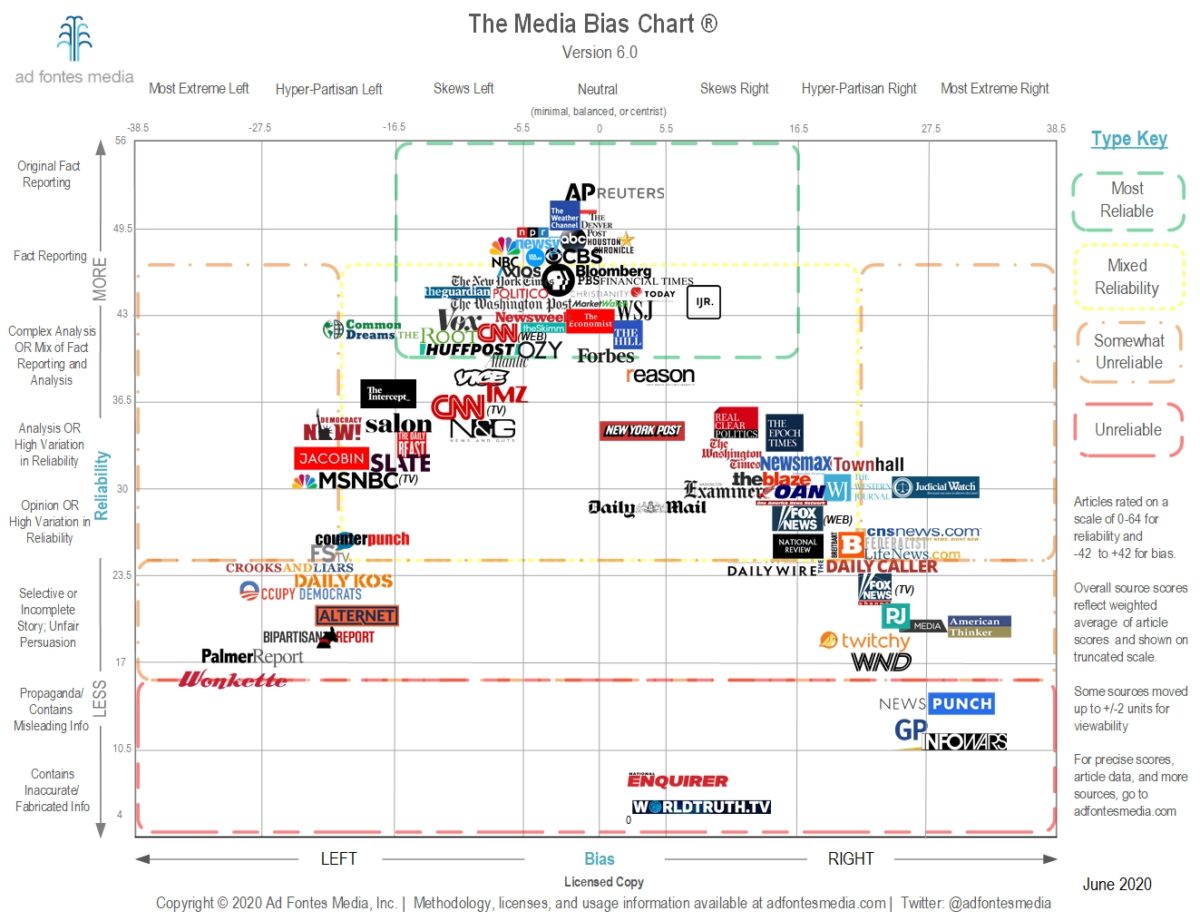
The Media Bias Chart 6, Ad Fontes Media
There is an updated version 6.0 (June 2020) of the Ad Fontes Media chart you have shared. It appears to incorporate even more media, but is navigable in the version 5.0 interactive form.
The Canadian Encyclopedia has a very nice article about the kinds of bias that can appear in the media, with examples from Canadian contexts.
I did come across a “bias chart” of Canadian news media, posted on Twitter, however based on the attached tweet and other information surrounding the tweet, I question whether it is based on objective data or whether it actually represents a bias inherent in the poster/artist who created it?
Is there bias inherent in the following representation of the bias in Canadian media? There is no attached data or cited source to support this image.
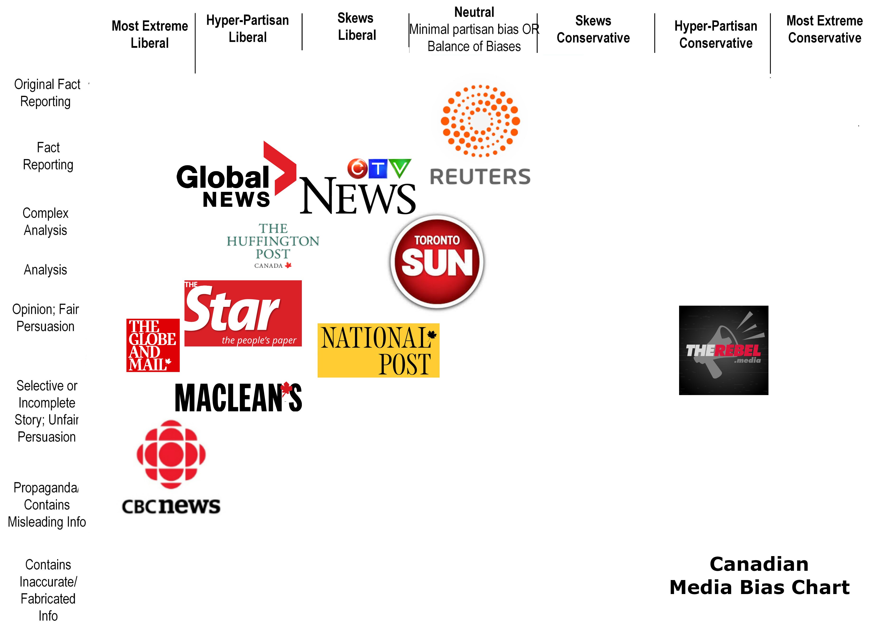
unattributed source: “Canadian Media Bias Chart,” shared on Twitter
What do you think?
How would you go about assessing the validity of this representation?
It would be interesting to know if Ad Fontes Media has data to support the verification (or creation) of a Canadian Media Bias Map.

I’m a Social Studies teacher and the Humanities Curriculum Specialist for an online curriculum company. I teach political studies and am currently writing a Political Studies 12 course. The Canadian chart is an extremely unfair representation of reality, in my opinion. CBC news does skew slightly left, but not extremely, and it is generally quite reliable. National Post is much more biased to the right; Globe and Mail is slight left but still extremely reliable; Toronto Sun should be far more to the right and far less reliable; Global News and CTV are more centrist. The lack of objective data to back up the opinion of this chart is unfortunate, but I think the right-leaning bias of the creator is clear.