Technology


Google Data GIF Maker: Not Sophisticated, Potentially Misleading?

“Google Data GIF Maker – BEWARE,” animated GIF by @aforgrave

A couple days ago I wrote a post entitled Google Data GIF Maker: Not Ready for Prime Time. I was intrigued with the ease with which it created a nice animatedGIF.

However, I was:

  1. confused by the limited documentation;
  2. perhaps mislead a bit by the interface;
  3. concerned about the results it produced.

I continued to poke around a bit more in the days that followed. I wanted to understand how the tool might be processing a set of values and deriving the visualization. I submitted the following data set to the tool:

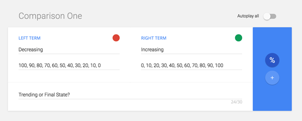
“What will the Google Data GIF Maker do with this data?” capture by @aforgrave

The Data GIF Maker generated the following:

“Increasing & Decreasing Data: What does this show?” animated GIF by Google Data GIF Maker

Clearly, something didn’t seem to be jiving with my expectations.  Yes, there is a trending from right to left (green increasing, red decreasing), but what does the final state mean with red at 0% and green at 100% yet displaying bars of relative width at a ratio of 1:4? (I counted pixels. 120 red, 480 green for a 600 pixel wide GIF.)  This seems remarkably similar to that odd 80% that I kept arriving at in the previous post, and is very misleading. What’s going on?

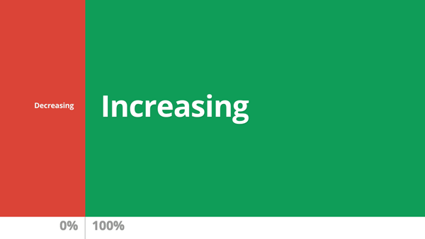
“What Does This Represent?” (final state of data GIF)

This morning I followed the breadcrumbs back to the original source post upon which the rest of the Internet had based its promotions. The post, Make Your Own Data GIFs with Our New Tool, was authored by Simon Rogers, (@smfrogers, on Twitter) Data Editor at the Google News Lab. I noted a couple of details in his post which seemed new to my understanding — and critically important.

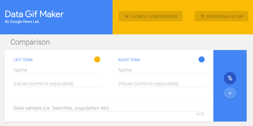
First, the post clearly provides simple numbered instructions — something that seemed to be lacking in the re-hashed third-party blog posts I originally read. The first numbered instruction is clearly at odds with the instruction within the Data GIF Maker interface.

Where Simon’s instructions state “1. Enter two data points,” the interface instead provides two fields, with each asking for “Values (comma-separated).”

Second, the title bar on the page also seems at odds with the actual function.

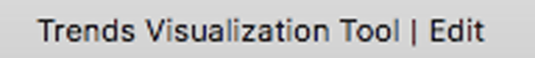
Whereas the title bar reads “Trends Visualization Tool,”  the details in Simon’s post state “If you want to show search interest, you can compare two terms in the Google Trends explore tool, which will give you an average number (of search interest over time) for each term (emphasis added). Then input those two numbers in Data Gif Maker.”  In other words, calculate the average values for your two sets of data, and put them in here. What? No trend over time is actually assessed by the tool?

So, for all the appearance of taking sets of data and showing how they change over time, my previous suggestion that the tool simply animates a wobble back and forth seemed to be actually in tune with what the tool was designed to do, namely, given two data points, provide a flashy, eye-catching wobble that arrives at a clearly determined comparative ratio. No real data crunching happening here folks. No trend being visualized. Nothing to see here. Carry on.

Note, however, that this tool is aimed at journalists, and offers them a way to quickly create visualization that suggests a trend or a change over time (“Trends Visualization Tool”). Without proper understanding and application, such a tool could very easily create a very misleading effect, unintentionally or otherwise.  As readers and consumers of media, we need to beware anything that could be misleading.

In closing, consider the same data provided above, but crunched as per the instructions.

“Crunch the Data the Google Trends Way,” animated GIF by @aforgrave

Does the following Google Data GIF Maker product in any way visualize either the trend OR the end state as reflected in the data?

“Trend? Final State? Or Just Two Averages? ” animated GIF by Google Data GIF Maker

I would like to see this tool evolve to do what I had originally hoped it was doing. I don’t think the code required would be all that difficult to implement.

However, I do believe that Google needs to be really clear up front with us about:

  1. how they want folks to be able to use the tool;
  2. what the tool is actually doing;
  3. and most importantly, what their understanding is of how the general population will interpret the results.

I’m going to forward this post to a few folks who have a lot more time and experience invested in Data Visualization than I do. Perhaps they can chime in and let us know where this might be going over time.

Attribution

Masterplan font by Billy Argel from fontspace.com  (licensed as Freeware, Non-Commercial)


Google Data GIF Maker: Not Ready for Prime Time? 1

Interface for Google’s Data GIF Maker, screen capture by @aforgrave


June 3rd: This is now the first of two posts on this topic. The second post, Google Data GIF Maker: Not Sophisticated, Potentially Misleading, documents some additional investigation. Please consider the two posts in tandem.

Given my fondness for making animated GIFS (see posts tagged animatedGIF on my de•tri•tus blog), the announcement of the Google Data GIF Maker last week had my attention from the start. It looked like a really cool tool for visualizing the relative quantities of two sets of data (two web search topics, say, or the frequency of tweets from two different Twitter accounts). No sooner had I seen it, than Doug Peterson (@dougpete, on Twitter) tweeted about it and mentioned me to make sure I knew about it.

I poked around with the tool, but lacking any documentation (and not finding any in the articles (here’s one, here’s another) that had been posted to announce it), I was flying blind as I tried to get it to work. Did it draw the values from a couple of search URLs? Nope. I looked at the examples. With two numbers (one in each of the Values fields) that summed to 100, it would wobble back and forth and end up with a split representing their relative fraction of the whole. But clearly it must do more than that! It was asking for comma separated data values. Hmmmm. Clearly I needed two sets of relative data that it could compare!

Peter McAsh (@pmcash, on Twitter)was kind enough to download an archive of the @BringIT2017 Twitter account for me to compare with the data that I have from the sister @ecooWeb Twitter account. I spent a few minutes formatting the monthly data into comma-separated values, and then unleashed the tool on the data. The fan came on my laptop, the web tool ground away for numerous minutes, and then it gave me this:

Comparing Tweets by Month, 2015, for @BringIT2015 and @ecooWeb, generated with Google Data GIF Maker (GIF is 4.6 MB!)

It looked nice, but somehow, the data representation didn’t look right. Despite one number significantly dwarfing the other, the visual splits seemed to be somewhat arbitrary.

I tried again using data from 2016, which I knew from inspection was even more offset in favour of @BringIT2016. Still, it didn’t seem right at all.

Comparing Tweets by Month, 2016, for @BringIT2016 and @ecooWeb, generated with Google Data GIF Maker (4.7 MB)

I was also puzzled by the fact that both years resulted in an 80/20 split — Not only did that seem highly coincidental, but I also knew that it was not correct. Maybe I was misunderstanding the tool? I tried the 2016 data again using the “+” option rather than the “%” option. Hmmm.

Comparing Tweets by Month, 2016, for @BringIT2016 and @ecooWeb — using + versus %, generated with Google Data GIF Maker (4.6 MB)

Was the %/+ nothing more than a numerical unit in the footer? Perhaps it has NO effect on the function of the tool.

By this point, I was actively questioning whether the Data GIF Maker was even representing the provided data in the GIF, or perhaps it was simply animating the wobble back and forth and just listing data points in the footer. (I knew the answer — and realized that I could simply confirm my belief by grabbing a single frame from the gif — see below), but I wanted to press on and see if I could actually get the tool to accurately represent the data. Maybe the Data GIF Maker wasn’t as smart as I was expecting it to be? I was assuming that it would take the two corresponding data points from the two lists, do a mathematical comparison on each to generate their relative fractions A/(A+B) and B/(A+B) and express/draw them as percents of the total width — but perhaps I needed to present the data already pre-calculated for it? I transferred my data into a spreadsheet, performed the calculations, and re exported the data as percentages of the total into two pre-compared lists.

Data re-transferred into percentages, for the period January 2015 through to May 2017.

Here is the final result.

Comparing Tweets, Relative Percentage, Jan 2015 to May 2017, for @BringIT2016 and @ecooWeb, generated with Google Data GIF Maker (4.6 MB)

Yeah. The animated representation is all glitz, and doesn’t accurately represent the true data at all. That’s really too bad. Here is the same GIF, but I have slowed down the frames so that you can see the percentages listed and compare them with the relative proportions of the whole. They are completely arbitrary and way out of whack!

Comparing Tweets, Relative Percentage, Jan 2015 to May 2017, generated with Google Data GIF Maker — GIF frames slowed down. (733 kb! Much better!)

The Google Data GIF Maker might look cool, but it is extremely misleading!

I spent a few minutes with a spreadsheet tool to create a stacked bar graph, and then took the resulting graph into Photoshop to create what I had actually hoped the Data GIF Maker was doing. Here is my own animated GIF of the actual data, represented in proper proportions of the width/area.  Enjoy!

My own data GIF of the same figures, created using Excel and Photoshop, by @aforgrave  (435 KB, and that’s at 256 colours!)

Some notes regarding the GIFs created by the Google Data GIF Maker:

  • The GIF files are huge – on the order of 4-5 MB each.
  • To get the smooth animation, they have a lot of frames, literally hundreds of frames for 12 pairs of data points.
  • The files don’t use an optimized colour palette, which also increases file size considerably. They could easily get away with an 8 colour palette.
  • All those decimals in the percentages suggest a precision that doesn’t exist in the data.
  • And again, they emphasize glitz at the expense of accurately representing the data. It’s nowhere close.

I’m keen to see the Data GIF maker evolve, as it certainly creates a nice product with much less effort than is required to do the same task manually. However, for the time being, the fact that it doesn’t accurately show the data is a deal breaker.

Here’s hoping the code will evolve to address that!


I’m a Member of ECOO — Are You?

“I helped Bring IT, Together,” animatedGIF by @aforgrave — Share using the #ecoo tag

Having attended the 2016 Bring IT, Together conference in Niagara Falls last November, I am a member of the Educational Computing Organization of Ontario (ECOO). If you attended #BIT16 last fall — even for a day — then you are a member of ECOO, too!  This frequently comes asa surprise to first-time attendees, but it is true!

Your ECOO membership is supported by a $25 annual membership fee, which for most members is collected as a component of the conference registration. Folks who do not attend the annual conference can elect to pay the $25 fee directly to the ECOO office, thus maintaining their membership, although most members simply renew by attending the conference annually.   Life members are recognized for their service to the organization over the years and are exempt from paying the annual fee.

Your ECOO membership cycle is tied to the timing of ECOO’s Annual General Meeting. Attendees at November’s #BIT16 have a membership which extends through the remainder of this school year, through the summer and into fall, expiring at the subsequent AGM with the conclusion of voting. In 2013, ECOO moved to include an electronic balloting process for the selection of the Board of Directors, so even if you do not attend the conference in a given year, you remain eligible to vote as long as your membership is current.  Active ECOO members may nominate their peers to stand for the Board of Directors, and may also stand for election to the Board themselves. Watch for details related to the Call for Nominations to the Board of Directors later this summer. The Call remains open for three months so that there is plenty of time to nominate your peers or consider standing for nomination yourself!

I have been a member of ECOO for over 20 years now. The organization provides a great opportunity to connect with new colleagues and collaborate with longstanding education friends.

ECOO is more than just the annual conference, and so if you are a recent conference attendee (and thus, a member!), reach out with the #ecoo tag on twitter, say hi, and connect with other members throughout the year!

The ECOO Board of Directors are currently conducting a survey of the membership and would like your input! If you have not yet submitted your thoughts, please take a moment now to do so! The Board is working to establish future priorities and needs to hear from the membership! PROVIDE YOUR INPUT NOW

NOTE: The “I helped Bring IT, Together” animated GIF above is based on my original, “Doug Peterson Brings IT, Together” animated GIF from November, 2016.  I snapped the pic of Doug with his animated shirt at the ECOO registration booth.

“Doug Peterson Brings IT, Together,” original animated GIF by @aforgrave


Doug and Pete’s Technological Listing of 10 Things to Fear 5

Comfort Zone, credited to Barrett Brooks

What Do Educators Fear About Using Technology?

Doug Peterson (@dougpete, on Twitter) and Peter McAsh (@pmcash, on Twitter) sat down to brainstorm a response to the original Colleen Rose’ post What Do Educators Fear About Using Technology?, and Doug posted 10 Things to Fear this morning. As I read through their list, I found myself mentally generating possible responses to their compilation, and found myself drawn to reply:

First, let’s look at fear:

Fear: an unpleasant emotion caused by the belief that someone or something is dangerous, likely to cause pain, or a threat.

Definition: Fear, as returned via Google, edited


Perception, Attitude, Behaviour and Learning Outside our Comfort Zone

Year’s ago, I learned that our behaviours are influenced by our attitudes, and that our attitudes are influenced by our perceptions. Fear is perceived — we need to start with our perceptions of technology and our come to grips with our attitudes towards it so that we can modify our behaviours as we address its role in supporting learning.

Moving from fear towards comfort requires moving through a zone of discomfort.  I did a quick search for a header graphic and selected the one seen above (Comfort Zone, credited to Barrett Brooks (@BarrattABrooks, on Twitter) via a How your Comfort Zone is Sabotaging your Success on Huffington Post.) You may be interested in seeing the results of my simple search and choose a variant that works for you.

I will confess up front that there are times when I find it difficult to encounter fear with technology. And as a result, I found myself coming up with some rather flip responses to some of the entries on Doug and Peter’s list — there are no doubt some real challenges expressed there. But I also found that a good number of the entries on Doug and Peter’s list would be what we might term as “heard rationalizations,” — things that we have heard people say over the years, rather than true rationales against using technology. Rationalizations help you argue against something with yourself. Instead we need to cultivate with our learners a “find a way” mindset towards finding solutions. So watch for a few short comebacks embedded within the following. But in general, I’ve also tried to provide a start at a valid set of possible supports.

Developing a comfort with discomfort is a great way to start.

My responses to 10 Things to Fear.

  • “The kids know more than I do!”
    • In life, everyone knows different things. Learn to learn from one another.
    • Ask yourself, “When did you stop learning? Why did you stop learning?” “What do you think you need to learn more about?”
  • “I don’t have time; so many other things that are more important.”
    • What is more important than learning?
    • Re-assess priorities from time to time. Think critically about what you are doing and whether it still fits. Maybe there is a newer, better way?
    • Buddha says, “Your purpose in life is to find your purpose in life.”
  • “How do I know that it fits the curriculum?”
    • What a great question! Ontario’s Language curriculum is dated 2006, which is before Twitter existed. The “leader of the free world” exerts considerable influence through his “writing” via the technology of Twitter. We always need to assess the relevancy of the curriculum.
  • “My school doesn’t have enough computers for every student to have their own.”
    • Get more.
    • BYOD
    • Have your students share. Re-organize lessons to use groups or centres. (There are days when I still struggle with this. But it works.)
  • “I need a workshop on this.”
    • Find a friend to learn with.
    • Search YouTube for a video.
    • Join an open, online course.
    • Worst case, go find a workshop on this. But seriously, we don’t need workshops on everything; We need to change our beliefs and then our behaviours about how we learn. In this day and age, waiting for a workshop is an excuse.
  • “Nothing worse than booking the lab, taking the entire class there, and then half the computers are broken.”
    • Yeah, that is a bummer. Been there. As I learner, I would be ticked off. I’m sure the principal, the superintendent, the trustees (and the parents of your students!) don’t want half the computers to be broken. This is a school issue, and there are folks who can help you to get it addressed.
    • In the meantime, have the kids work with a partner.
  • “It’s not in the curriculum.”
    • See “How do I know that it fits the curriculum?” above.
    • “Coding” is only minimally reflected in Ontario’s K-12 curriculum. Ontario currently faces a shortage of programmers on the order of tens of thousands per year. The Ontario Ministry of Education knows this. But so do a lot of teachers. A lot of teachers are making space for coding, rather than waiting for “a curriculum.”
  • Too much curriculum; not enough time to experiment.”
    • Time is a real constraint, no doubt about it. What is important?
    • With time, you can learn to make time. Again, learning is an investment. Careful investing requires making careful choices.
  • “I’m not sure I have a login on the school network.  Who do I ask?”
    • Ask a colleague at your school.
    • Ask your office administrator.
    • Ask your best teacher friend who teaches at a different school.
    • Ask your principal.
    • Check for a “help desk” on your district’s web site.
    • Email someone on the OSAPAC committee.
    • Follow up with that person you met at that conference you went to a year ago with whom you exchanged emails after you had that discussion about that thing.
  • “I have a Mac at home and the school has Windows.”
    • Excellent! You can do a lot great stuff with a Mac!
    • 95% of what you need is web-based, and the web is cross-platform. Your school is good to go, as long as you have good Internet.
  • “The IT Department has the computers locked down and I can’t run the software I need.”
    • 95% of what you need is web-based, and the web is cross-platform. Your school is good to go, as long as you have good Internet. Is there an echo?
  • “What if the kids get into a porn site?”
    • Responsible IT departments have this covered for you.
    • Relax. Most kids are immediately horrified whenever something even remotely “inappropriate” shows up on a screen at school.
  • “I can teach the topic better without technology.”
    • Can the students LEARN the topic better WITH technology? If so, use the methods that best support their learning.  It’s not about technology OR your teaching, it’s about their learning.
    • Technology is not the answer to everything, and not everything is best learned via technology. Us it when it makes a difference.
  • “I’m a Google person trapped in a Microsoft world or vice versa.”
    • Ouch. Yeah. Or a Mac person trapped in a Microsoft world.
    • Either make friends with what you are given, advocate for alternatives, or find ways to transfer the necessary skills to your board’s chosen platform.
    • Be happy, in the olden days, folks worried about whether they had WordPerfect or MS-Office, and honestly, it’s what you write that is important, not the program you write it in. But yeah.
  • “Our computers are too old and not powerful enough.”
    • They must be good for writing.
    • What is the replacement cycle at your school/board? If they are that old, you are just about to get an upgrade!!!!
  • “I’m concerned about student privacy.”
    • Being cautious about student privacy is a good thing. It’s not an excuse to do nothing.
    • Use your concern about student privacy to learn and educate your learners.
  • “I’m concerned about my own privacy.”
    • Being cautious about your own privacy is a good thing. It’s not an excuse to do nothing.
    • Use your concern about privacy to learn and educate yourself. Again, find a friend to learn with.
  • “Somebody needs to be the champion of cursive.”
    • I discovered one day (not too many years ago) that it is important to know cursive so that you can read cursive.
    • I discovered one day (not too many years ago, but the same day as I discovered the item above) that very little of what we encounter in schools today is written in cursive.
    • I also learned that using cursive as an educator exacerbates the learning challenges for my identified students, and that printing fits a UDL model. My printing has always been easier to read than my cursive.
    • Voice-to-text is a marvellous technology. For everybody.
    • Slowing down the brain by writing by hand still has a place in helping one to think.
  • “Nobody has ever hacked my filing cabinet.
    • Probably true. But are you sure?”
    • Nobody is likely to hack your computer for your lesson plans either. Worry more about your PIN and your bank card.
  • “The printer never works – I have to print their work so I can mark it.”
    • No you don’t. (I really only ever had this as a need once.)
    • Learn to print to PDF. CutePDF is one of many answers if one doesn’t already exist at your school.
  • “What if the technology isn’t charged and goes dead in class?”
    • Been there. It’s a lesson in learning to be prepared, and one that your learners need to learn to deal with themselves.
    • Do you have a car charger for your phone? Why?
    • Be that person at a conference who totes around a power bar or extra phone battery. You can make friends that way. (‘Truth!)
  • “I tried once and failed badly.  Once burned, twice shy.”
    • There is a story floating around about Thomas Edison and the light bulb. The number 10, 000 comes up in it. He probably got burned at least once.
    • There is an acronym floating around: FAIL: First Attempt at Learning.
  • “Phones are banned in my school.”
    • Do you need phones? What question are “phones” providing the answer for? Is there another answer?
    • My P/J students don’t have phones. Getting phones isn’t an answer to their needs.
    • Why are phones banned? Who do you need to convince? (Answer: You only need to convince yourself to get started on this path …)
    • Are phones banned for teachers and administrators, too? Is this hypocrisy?
  • “The bulb in my data projector is burned out and my principal won’t replace it.”
    • Yeah. Data projector bulbs are pricey, no doubt.
    • Why won’t your principal replace it? Is the issue financial/budgetary, or is it philosophical?
    • Back in the day, I arrived at a new school one September and we had ONE overhead projector for the whole school. We were promised we would have new overhead projectors for all for the following September. Back then, I decided that rather than have my practice and my classroom be disadvantaged for a whole year, I would buy one myself. A couple years later, I lobbied my principal for a SMART board, and the overhead projector became redundant. How important is a particular piece of technology to your teaching and learning practice?
  • “Nobody else does, why should I?”
    • Do you believe that “it” is important?
    • Somebody needs to be first. Why not you?
    • Somebody needs to be second. Why not you?
    • The person who goes first needs a friend, and the person who goes second can be that friend. You and a friend can share the honours and support one another.
  • “What do I do when something goes wrong?”
    • Excellent question! What DO you do when something goes wrong?
    • Learn to develop the comfort requried to answer the question, “What do you do when something goes wrong?”
  • “I don’t want to show a weakness in my knowledge in front of the class.”
    • Knowledge Doubling Every 12 Months, Soon to be Every 12 Hours
    • Nobody expects you to know everything. You may be an expert in one or several fields, and in those areas you are likely well ahead of your learners. But our understanding of the world is continually evolving, and you probably know that.
    • You probably already know that kids like to connect with the real you. Encourage a two way dialogue about learning. What can you learn from them?
  • “I’ve never had a Scratch workshop; maybe my school could hire somebody.”
  • “What if a student puts 2 spaces after a period?”
    • As a learner and as a educator I put two spaces after a period for decades and the world never ended. It was the convention then. Nobody complained. Then one day I read an article about how the convention was changing (print publishers needed to save money and someone had calculated the real savings) and so I simply taught myself to tap the spacebar once instead of twice after a period. Today, I only worry about having an accidental double-space between words in my report card comments, because THAT is the one real no-no where it matters.
  • “What if their essay or report includes emoji?”
    • Do you include emoji in your emails and texts? 😉 I’m partial to the winky-face, because there is a lot to wink about in learning. You can even say “smiley face” or “winky face” to Siri and she will put it in your paragraph or text for you!
    • Consider audience, context, and format. Emoji are a new addition to our text-based communication, originally a work-around on the limits of the keyboard as a way to include emotion. Maybe you can work with the learner on tone, voice, and the use of irony and hyperbole as new techniques in communicating on multiple levels?
    • Remember that primary students are taught to self-assess their work using smiley faces before they learn to couch their emotions in words. Words are just a different symbolic representation.
  • “Many of the resources have US content. What about Canadian resources?”
    • US English. UK English. Put a U in colour, honour, neighbourhood. Can you get a little Canadian Flag to show in the menubar instead of the US one?
  • “It’s the librarian’s job.”
    • Lucky you! You have a librarian.
  • “How do I mark it?”
    • Ask the Ministry of Education. (Sorry, that’s an old joke.)
  • “If my board or school thought it was important, they would do workshops and train me.”
    • Breaking News: Boards and Schools don’t have a monopoly on deciding what is important.
    • Breaking News: Board and Schools don’t have the time and resources to do workshops and train you on everything you need/want to know.
    • OTF, OSSTF, ETFO, AEFO, OECTA, and TVO all offer workshops for teachers. So do our professional subject associations.
    • Search out an #edCamp near you!
  • “Two words – Fake News”

I think I got a bit punchy towards the end. Maybe Doug and Peter were scraping the bottom of their barrel by that point, too.

Help to Make Peace with Technology in Learning

For anyone who might like to add to this — especially with concrete responses to the real challenges, feel free to ask for access to edit the shared document that I’ve made available to Doug, Peter, and Colleen.

Again, learn to develop a comfort with discomfort!

If you are a member of the Educational Computing Organization of Ontario (ECOO), look to bring a colleague or three to the annual Ontario education technology conference, Bring IT, Together #BIT17, November 8-10th in Niagara Falls, Ontario.

If you are NOT a member of the Educational Computing Organization of Ontario (ECOO), you automatically become a member by attending our annual Ontario education technology conference, Bring IT, Together #BIT17 November 8-10th in Niagara Falls, Ontario. So come, and bring a colleague or three with you and learn together!

There is nothing to fear, technology-using educators are a friendly bunch!

#BIT17 Bring IT, Together 2017 promo, by aforgrave


Do You Dream of Databases? 2

“Sunset on a Set of Boxes Sitting,” image by aforgrave, on Flickr

Cross-Posted from a long comment response to a Doug Peterson (@dougpete) question, “Whatever Happened to Filemaker Pro?” on his Doug – Off The Record blog.

I knew when I read Doug’s post this morning that it would be impossible for me to let it go without commenting. But where to start? How could I start and not go on for hours and hours? And I expect that he knew that it would be difficult for me to not reply. I remember the day when John Taylor introduced us to one another at ECOO. I’m fairly certain he was looking at pushing the OSAPAC database of licensed software to the web from FileMaker at the time.

My original thought was that I would reply by writing my own post on my own blog. But the post would be out of the blue and wouldn’t have the context that Doug’s post provided. In the end, I posted a long comment on Doug’s blog, and based it on his prompt questions. To go broader would open the floodgates and I’d never get any sleep. But I did decide to cross-post it here to EdVisioned.ca all the same. After all, I spent upwards of five years from 1998 to 2003 breathing, eating, and sleeping in Filemaker. I’m sure I had a few Filemaker-inspired dreams along the way.

Have you ever developed a database application in Filemaker Pro?

Database101Oh, yeah. You know I have! It all began with a demo version on floppy disk in the back of Guy Kawasaki’s Database 101 book, purchased one lazy Sunday afternoon while browsing computer section at the the local bookseller, a year or so after I started teaching. That was pre-Chapters/Indigo, pre-Internet. But I did have a Mac, and a background in programming and Hypercard, and the first real project was to develop a lesson planner for a summer course I was taking. Why spend all that time formatting the pages when common fields across the various lessons in the unit could be automagically arranged, and I could add and re-sort the lessons with a nice table of contents to boot? I remember carrying that Mac to and from class and school in one of those big bags.

“Ontario Curriculum Unit Planner,” photo by aforgrave, on Flickr

Subsequent to that, the Class Organizer was a database that I developed and then shared at an ECOO SIG-ELEM in Kingston (Doug wrote about Special Interest Groups last weekend), and then came a school report card in my third year of teaching — followed by district Report Cards, Provincial Report Cards, and then the Ontario Curriculum Unit Planner (units still available via Queen’s University as PDFs) for the Ministry of Education.

Do you have a need for a database in the things you do on a computer?

To this day, I maintain student records and manage a bunch of classroom tasks from within Filemaker. Record keeping is the very raison d’être of a database, but the reality is that most folks do not “think” in terms of databases. I’ve had conversations with people over the years (looking at you, Peter Skillen) about how our thought processes and problem solving are influenced by the tools we understand and use. You are familiar with The Law of the Instrument, perhaps as initially clarified by Abraham Maslow in 1966: “I suppose it is tempting, if the only tool you have is a hammer, to treat everything as if it were a nail.” For years and years, the hammer of choice for many in Ontario was WordPerfect, and every single problem was solved with it. Now, decades later, comfort with spreadsheets has increased, but the subtleties of difference between spreadsheets and databases are lost to most. While visiting the Google Showcase at pre-ISTE NECC in 2009, I recall asking their booth folks if Google had a database program under development to complement Docs, Sheets, Slides — and I just received blank stares from the folks there. Now, a few years later, even Microsoft’s Access has disappeared from Office365. Databases are a hidden entity. They manage our finances, they organize and store our blog posts behind the interface of WordPress, but most people do NOT think of a database when faced with a database problem. It is not in our toolbox.

What sorts of things do you collect that would be suitable for inclusion in a database?
There was a time when I worked towards what one might call The Grand Unification of Data Architecture, where any and all information worth capturing was stored within a set of linked databases and was available to be searched and cross-linked and referenced with other related bits of data. Calendar entries, journal entries, financial data, family and contact information, events, presentations, goals, books and movies and media, quotes and research findings, long-range plans, any and all information belonged gathered together in a single related data-entity. As it has turned out, in the same way Facebook has given a web presence to the masses in a way that HTML never did, the multitude of mobile apps that exist today for managing groceries, workouts, friends, photos, and so on have provided everyone with a splintered and fractured collection of databases that can be used without truly understanding the methods beneath. Have a problem? There’s an app for that, no need to solve the problem yourself.

keep-calm-there-s-an-app-for-that-MODIf you’re not using a Filemaker Pro version, what are you using instead?
Over the years, I have played around with other data structures, MySQL being the most long-standing complement to my use of the latest versions of Filemaker. When the web really kicked into gear in the 2000s, the gathering and provision of data via AJAX became a new technological pursuit for me. That meant working with MySQL, HTML/CSS, and Javascript — three separate components. From the days of FileMaker 2.1 through FileMaker 15, one of the strongest features of FileMaker has been the way in which it marries the traditional modal-view-controller components within the domain of one application. With Filemaker, developers simultaneously manage the data structure, the interface, and the business logic. The most recent releases of Filemaker continue to support publishing web interface as well as generating mobile apps. For me, however, with today’s prevalence of apps and cloud computing, a lot of my data is stored within someone else’s data architecture. There are instances when I wish it were easier to hook the bits together, but the need to create things from scratch out of necessity has been supplanted over time with ready access to a multitude of specialized apps. The emerging potential of APIs has yet to be realized.

A Hammer, a Screwdriver, and a Flashlight?
In closing, as with coding, there is an untapped depth of problem solving potential that today’s learners are missing out on because the strengths and benefits of database structure and manipulation are not readily understood by folks. We have a wonderful category of tool available to support our thinking, but it’s not in the toolbox of the masses. A screwdriver may have joined the hammer for some, and perhaps a flashlight once in a while, but we really have yet to explore the full set of tools to which we truly need access. Databases are one such tool.

hammer_PNG3890

“I suppose it is tempting, if the only tool you have is a hammer, to treat everything as if it were a nail.” – Abraham Maslow, 1966.


#ThinkingFlow

Transcript

Like you, I spent much of my time learning to think with a pencil in my hand. The results of our school learning and thinking were captured on paper that wound up on the teacher’s desk. Textbooks and notebooks were both medium and message. Although the pencil remains a versatile tool that influences our thinking processes, we need learners to be agile with a variety of tools.

Today’s learners have the potential easily create and manipulate documents, photos, audio and video files, are developed across a variety of different devices and a in variety of non-paper formats. The work of their learning no longer simply translates into stacks of paper on a teacher’s desk.

As our learning and working flow more easily from one medium to another, how will this affect the flow of our thinking?
How must we adjust learning over the next three years in support of a smoother #thinkingflow?

Attributions