aforgrave


Clarifying the Ontario Health and Physical Education Curriculum 1

First, Watch This

Ontario’s new Minister of Education, Lisa Thompson (Huron-Bruce) (@LisaThompsonMPP) took slightly under three minutes today to attempt to address some questions surrounding her government’s confused messaging around the Health and Physical Education Curriculum.

My take-away from those three minutes were three continually restated messages (please forgive me if I misunderstood any of them, but I think her repetition helped with my summation):

Minister Thompson’s Three Messages:

  • “In September, teachers will be using the 2014 curriculum (6x). Teachers are going to be familiar with the curriculum because they utilized it in 2014. I have every confidence teachers will be using the curriculum from 2014, because they’re familiar with it.”
  • “(In the fall), we will embark on the most comprehensive consultation (5x) this province has ever seen when it comes to education. We made a campaign promise to respect parents …. and we’re going to be doing that. We heard from tens of thousands of people from across this province during the campaign that they were not consulted.”
  • “I encourage [Teachers] to become involved in the consultation (4x). I encourage anyone who wants to share their perspective to do so.”

Throughout the interview CityNews reporter attempted to get clarity from Minister Thompson regarding the actual “2014” curriculum (and/or the 1998 curriculum) and the Minister would only refer to “the 2014 curriculum/the curriculum used in 2014.”

So, how can we clarify “the 2014 Curriculum”?

Currently the only HPE curriculum available on the Ontario Ministry of Education website is the 2015 document:

It should be noted that this document is accompanied by a large collection of support documents including:

So, Where is “the 2014 Curriculum” ?

The Internet has come a long way in the last 20 years, and is a significant element in both influencing and understanding why a 1998 curriculum is out of date in 2018.  You can actually use the Internet to go back in time to specific dates via an archive called The Wayback Machine. So if you want to see what curriculum was on the Ontario Ministry of Education website on say, March 25th, 2014, you can!

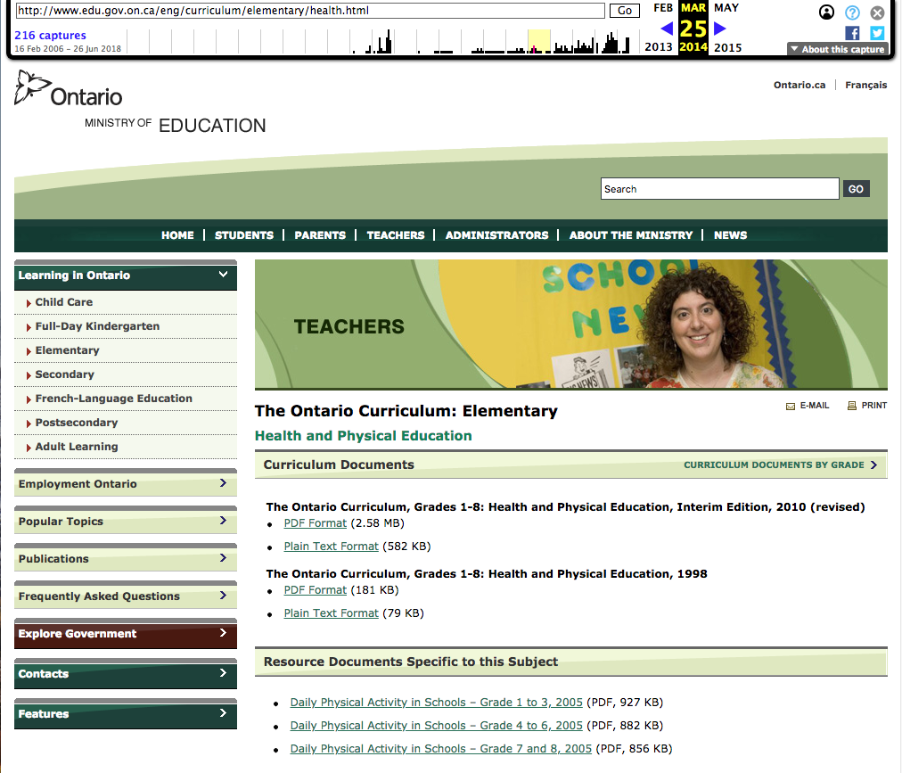
edu.gov.on.ca from March 25th, 2014 via TheWaybackMachine, capture by @aforgrave

On March 25, 2014, the Health and Physical Education page listed two curriculum documents:

Despite significant consultation to arrive at the 2015 (revised) document, the Minister wants to return to what was in effect in the previous year, 2014. This would be the Interim Edition, 2010 (revised) curriculum.

So What Does the Interim Edition, 2010 (revised) document Say?

Page 32 of the Interim Edition, 2010 (revised) document makes clear why the document is so-labelled, and discusses what expectations Ontario educators are to address:

Growth and Development (1998). The Growth and Development expectations from the 1998 health and physical education curriculum have been included in this interim edition of the document pending further consultation on the expectations related to human development and sexual health that will be included in the final revised curriculum.

Throughout the 2010 document, the Growth and Development section (the contentious content within the Healthy Living strand that is coloquially labled “sex-ed”)  bounces educators, students, and parents back to what was in play in 1998.

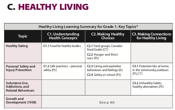
Reading through the 2010 (Interim) document we see the restated “sex-ed” curriculum from 1998.

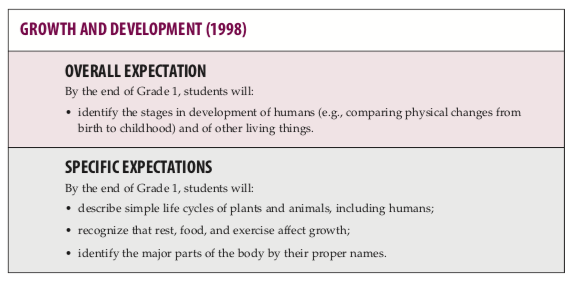
You can read all through the Interim Edition, 2010 (revised) document and see that the Growth and Development section remains unchanged from 1998.  It was, in fact, the need for additional consultation on the Growth and Development section in 2009-2010 that kept the Interim curriculum in place until it was approved following a comprehensive consultation undertaken by the Wynne Liberal government, culminating with the release of the 2015 (Revised) curriculum.

Aside from the same 3 documents supporting Daily Physical Activity in Schools going back to 2005, there are no other documents available in 2014. No parent guides, no grade-by-grade guides, no quick facts. So going back to 2014 would not only throw the 2015 Growth and Development strand back to 1998, but it would also remove access to all of those resource materials that parents and teachers have had access to since 2015.  Guides to topics such as Consent, Sexting, Mental Health, Concussions, and Staying Safe are new since 2014 — throwing them out is not in the interests of Ontario learners in 2018.

Parent Resources accessible in a multiple languages

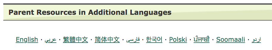
Also of interest with the current 2015 curriculum is the inclusion of parent guides not only in English, but also Arabic, Chinese (traditional, simplified), Farsi, Korean, Polish, Punjabi, Somali, and Urdu.  There is no evidence of similar efforts to communicate with parents on the page from 2014 and backwards.  Removing resources to support Ontario’s diverse learning communities does not reflect well on the “government of the people” either.

The Minister of Education Needs Stop Obfuscating

That the Minister of Education, Lisa Thompson, refuses to acknowledge that her “2014 curriculum” regarding Growth and Development (“sex-ed”) is from 1998, is very problematic. We should expect open and transparent answers from our elected representatives, and her responses from July 26th and earlier are clearly avoiding the issue.

The People Respond

Although Lisa Thompson has said little with any clarity since the initial announcement of the curriculum rollback, there has been considerable response to date:

As of this date, 16 18 Ontario school districts and 19 Ontario religious, health, and educational organizations have openly replied with public statements in response to the government’s announced repeal. Ontario educator Andrew Campbell (@acampbell99, on Twitter) is compiling a list of Statements on the Rollback of the HPE Curriculum, and adding to it daily.

To date (July 27th): Toronto District School Board • Waterloo Region District School Board • Trent-Valley District School Board • Peel District School Board • Kawartha Pine Ridge District School Board • Trillium Lakelands District School Board • Grand Erie District School Board • Bluewater District School Board • York Region District School Board • Durham District School Board • Halton District School Board • District School Board of Ontario North East • Ottawa-Carleton District School Board • Lambton Kent District School Board • Upper Grand District School Board • Hamilton-Wentworth District School Board • Simcoe County District School Board • Limestone District School Board • The United Church of Canada Ministers • The 519 • Next Gen Men • Action Canada for Sexual Health and Rights • Ontario Principals’ Council • Elementary Teachers’ Federation of Ontario • Society of Obstetricians and Gynaecologists of Canada • Registered Nurses Association Ontario • Sherbourne Health Centre • The Ontario Association of Home and School Associations, Inc. • Anishinaabe Nation • Association of Ontario Midwives • Faculty at Trent University’s School of Education • Prof. Lauren Bialystok (OISE/UT) • Ontario English Catholic Teachers Association • Ontario Physical and Health Education Association • Ontario Association for the Support of Physical and Health Educators •  Canadian Pediatric Association • Ontario Public School Boards Association • The Women Abuse Council of Toronto

Where Will You Stand?

If you are an Ontario educator or parent, where do you stand? Where does your Board of Education stand? How will you participate? 


==

Attribution:

The video at the opening of this post has been embedded from the original source, Education Minister gives confusing interview about sex-ed curriculum (July 26, CityNews)


The Media that Makes Us … 2

“TV — then” animated GIF by @aforgrave

This post started out as a comment on Doug Peterson‘s “Whatever Happened to … CMT Television?” from Sunday, May 27th, 2018. As has happened a few times before, in the end I decided it would be easier to post it here with all of the embedded media. As is often the case with Doug’s Sunday morning features, my mind was sent on a journey down memory lane by his question de jour.  

Doug frequently ends his post with a series of prompts, and when I have the time, I like to try to check them off while drafting my reply. I also need to remind myself every time NOT to draft my reply in the comment box on the web form — invariably I will lose much of my draft if I spend too long working in the web browser. When my iPad shut down today (it had reached 0%) I switched to a Google doc, and so it became a lot easier to add in all of the necessary links. 

  • Have you ever listened to CKNX?
  • How about CKLW?
  • How about CMT?
  • Do you have a favourite media start to your day?  Music, television, or something else to get the blood pumping?
  • In a world of specialty television stations, has a favourite of yours changed format?
  • Do you remember push buttons on the radio to access presets?
  • Did Bruce Springsteen have it right?

Have you ever listened to CKNX? My Early TV

As a kid, growing up in the country outside of Owen Sound, our farmhouse roof-mounted antenna received one television station, CKNX Wingham.  It was a CBC affiliate, and was found at channel 8 on the dial. (As the only station, however, there was no need to “find” it. We just left the dial at channel 8.)

If you watched CKNX Wingham channel 8, then you likely remember “Circle 8 Ranch,” and the set decorated with split rail fence, bales of hay, and barnboards.  The show featured local country regulars and guest artists. Believe it or not, after decades of not having thought of that program, I was just able to conjure the fiddled theme song from memory and hum it to myself.  Turns out it is called “Down Yonder.” I never knew the name until I found it referenced just now Al Heiser’s lyric in  “When Circle 8 Came On.”

Twice I travelled to the TV studio in Wingham to get recorded for TV. The first time was to participate as part of the local contribution to the MD telethon, and the second time was as a member of our high school Reach for the Top team.

I remember with great excitement when CKCO Waterloo installed a re-broadcast tower at Lions Head and we suddenly got a second station. It was a CTV affiliate, so it had something different from CBC.

The game changer came after the local TV repair man had to visit and repair our set (he had to replace tubes), and suddenly we got a third channel. As another CBC affiliate, he said it was the same as CKNX Wingham — but it was way better. CKVR Channel 3 Barrie was owned by CHUM/CITY out of Toronto, and it had a decidedly metropolitan flavor. It catered to the transplanted summer cottage crowd in the Muskoka’s and Halliburton. Suddenly, I could watch Star Trek!  I had only seen two episodes prior to that — “Spock’s Brain” and “Is There No Truth in Beauty?” while visiting cousins in Cambridge who had cable. By the time Star Trek arrived in my neck of the woods, it was in syndication, and it formed part of my end of the day routine the summer I had started working a full day during the summer to earn enough money for a ten-speed bike. We would start early in the morning, work for hours in the fields, and stop at 4:30, which just gave me enough time to settle in front of the TV for Star Trek at 5:00.

How about CKLW? My Early Radio

As for the radio, and CKLW out of Windsor, that also has a special memory. When I started driving on the farm (in my case, the tractor didn’t have cab, let alone a radio, but our panel van did), CKLW was the station that I tuned the radio to. Again, our local radio station CFOS had the news, and was a CBC affiliate. But CKLW came from far away (“The Motor City”) and it’s music was from a different place. Getting the radio station tuned in was part of the routine (adjusting the seat, adjusting the mirrors) before carefully starting the vehicle and putting it into gear. That would have been 1976. I was 14.  

CKLW top 80 from 1976 via RadioTimeLine.com

I also had an old radio in my bedroom (like the TV, it still had tubes in it — as well as push-button presets) and it played dialed way down at night beaming the music through the dark from Motown into my ears as I fell asleep, stirred during the night, and woke each morning. I bet that was pretty much the same for a lot of teenagers when radios were still a thing.

How about CMT?

Now, as for CMT, that has never really been part of my viewing/listening pleasure. I checked this morning to see if Longmire had been produced by CMT, but it turns out it was A&E. I have a vague recollection of watching some drama that might have originated on CMT, but I can’t find out what it was. As for tuning into CMT for the music, that’s something I’ve never done. I like ALMOST all kinds of music.

Kingston-based  Arrogant Worms have little tune called “Trapped in a Country Song.”

My Radio Today

For years now, I have turned my radio/iPhone/car to CBC Radio One for the news, for Ontario Morning (on the way to work), the afternoon drive from Ottawa (on the way home), and manage to pick up q with Tom Power, Gardening with Rita and Ed Lawrence, The Debaters, The Sunday Edition, The House and Day Six, Spark, Tapestry, Unreserved, The Next Chapter, This is That, Randy’s Vinyl Tap, As It Happens, The Current, and Ideas.  Heck — Check out the CBC shows, they’re all great!


The other place I have turned my radio for years is to SOMA FM, an Internet-based radio station out of San Francisco. I’m partial to Groove Salad, Space Station Soma, DEF CON Radio, Thistle Radio, and my real fav, Secret Agent. I usually have SOMA FM on when I’m at home working on stuff.

Over 30 unique channels of listener-supported, commercial-free, underground/alternative radio broadcasting to the world.

57 Channels, and Nothing On?

I cut cable TV 10 years ago and live on the Internet. So my TV now comes on demand through the Apple TV, the Internet, or an app. I’ve recently discovered the Acorn TV app and the BritBox app, and am enjoying a lot of Brit mystery shows.

Whaddabout the Newspaper?

I did buy a newspaper a couple of days ago (first time in many years), and I couldn’t get over how small it was. I asked the cashier how much it cost. He didn’t know. It was $2.50.


• Main section 3 pieces of paper folded = 12 pages.
• GTA section 1 piece folded + 1/2 page insert = 6 pages.
• Sports 2 pieces folded = 8 pages.
• entertainment section 2 pieces folded = 8 pages
• Smart money and business section 1 piece folded + 1/2 page insert = 6 pages.

Total: 10 pieces of Newsprint = 40 pages

25¢ per piece of paper.

Then and Now

There’s no doubt that media has changed since I was a kid. It used to be in black-and-white, only available when the antenna was permitting, and only arrived when it was scheduled to and based on what was available. Now it’s in full color, available 24/7, on-demand, and based on what you want.


ECOO is Going to Have an Election! 1

“Election Coming,” animated GIF by @aforgrave

The Educational Computing Organization of Ontario (ECOO) will be holding an election sometime within the next 30 days, culminating with an announcement of a new Board of Directors at the Annual General Meeting on Thursday, November 9th, 2017. The AGM takes place each year at the annual ECOO conference, Bring It, Together! (bringITtogether.ca)

The Call for Nominations officially closed on October 1st, 2017, and the word to the nominees from the Nominations Chair Kristy Lurker is that there are a number of contested positions this year. ECOO is going to have an election!

Each year, as per the ECOO Bylaw, the appointed Nominations Chair posts a Call for Nominations to fill four single-year positions on the Board executive (President, Vice-President, Secretary, and Treasurer), and two two-year positions for Directors-At-Large. [Because of an unfilled resignation in an existing Director-At-Large role, a third Director-At-Large position will be backfilled (to sit for the second year of the term), making a total of seven positions to be filled as of this year’s AGM.]

While details of this year’s process are yet to emerge, watch for the posting of the names and biographies of the nominees on the ECOO.org website in the coming days, as well as a notification via email to all eligible voters. Once the terms of the election are made clear, ECOO members are invited to review the qualifications of the nominees and consider what they would like to see their organization accomplish in the coming year and who they best feel will fulfil the mandate.

To all members, please participate in this important annual undertaking! Your ECOO Board is elected to serve you! Check out the Responsibilities of Board Members. Please select a solid group of representatives from your peers so that we can all keep the organization strong and thriving!


Keyboarding

“Keyboard,” by Dan_H, on Flickr (CC BY-NC 2.0)

Doug Peterson‘s Keyboarding post this morning relates a recent experience for him and raises some questions regarding keyboarding and its place today in schools. I originally started this as a comment response, but the GIF at the end needed to go somewhere, and so I share following here.

Ah, Doug!

Yes, you should have saved this topic for Sunday morning when I have more time to reminisce instead of getting ready for school. As such, this morning’s trip down memory lane may be slightly truncated.

So first of all, while most would say “hunt and peck,” my father would rather refer to the much less known, but perhaps more authentic-sounding  “Columbus Method.”  (With the Columbus Method, as dad used to explain, you spot a key and land on it.)

When it came to my course selection during high school (1976-1981), my dad was not supportive of my taking a typing course. I used the Columbus method (pretty efficiently, but without the option to copy-type) for many years to come.

Years later, when I got my first Mac, Mavis Beacon Teaches Typing was the program of choice. I spent some time with the program, but still used the Columbus method to get the job done.

As one of our first system-wide technology purchases back in the day, we invested in the ALMENA method (“learn the keyboard in one hour”) with the intent of having all grade 4 students learn to touch-type and thus save significant time getting their words into text through all the grades to follow. I recall this generated a bit of pushback from some secondary teachers who would have seen this as encroaching on their course enrolments, but the trustees saw the benefits. It was while I was supporting the ALMENA method that my superintendent walked by my desk one June and noted that I wasn’t a touch-typer. The irony of bit deep, and after a two week investment of practice that summer (some Mavis Beacon, some ALMENA), not only was I touch-typing, but able to copy-type as well!  (The true secret, as emphasized by that two-week endeavor), is to stop looking at the keys. Short term decrease in productivity, long-time return on investment)  Sadly, the Grade 4 initiative later went unsupported, and my guess would be that few folks are teaching keyboarding in our elementary schools today.

If we jump forward to the present day, however, we are past the advent of Dragon Naturally Speaking (which required that you train the software in the nuances (pun) of your voice) and we now have pretty good automatic voice-to-text available on our phones and through Chrome extensions like Texthelp’s Read and Write for Google Chrome.  Invariably there will be some faulty word recognitions which require manual editing, but the technology works quite well for confident speakers. It’s been an undertaking in my classroom in recent months to help kids gain some facility with this method. Speaking full sentences significantly enhances the context-recognition, and that tends to come from having a fully-formed sentence already in mind. As well, speaking your punctuation really helps, too. All the same, this past June we had exceptional students writing their grade 3 EQAO with the support of Read and Write for Google Chrome — and this advancement will only help more kids as we move forward.

In closing, I have noticed yesterday and this morning a couple of new “keyboard features” in the iOS 11 update on my iPad.

First, there is a single touch (swipe) gesture that can substitute for the two-tap (shift key, then tap) normally required for the secondary characters on the keyboard keys. If you simply swipe down on the key, you get the secondary character. It works quite well, once you get into the habit (still working on that, it’s only been two days). Whether it works in the long run (will we develop a separate muscle memory for keyboarding on a touch device? I use the Columus method there …) remains to be seen.

“‘Swipe Down’ keyboard / Microphone or Keyboard input (tiny buttons)” GIF by @aforgrave

The second “feature,” however, may yet still see further evolution before reaching a more practical state. Upon bringing up the iPad keyboard, the voice-to-text microphone key still rests in its spot to the left of the space bar. That’s where I expect it to be. But at the end of a voice-to-text input, the voice feature cancels back to a large keyboard space, but shows only a small microphone icon and a small keyboard icon. Perhaps the thinking is that having used voice-input, you will want to return to voice input? But if you want to return to the keyboard (which, if you are wanting to make a correction or two, seems to be the more usual case) you need to then tap the keyboard icon before you can begin revisions. I’m hoping that this can be adjusted in a preference somewhere, as it’s going to irk me until it gets fixed.

(Note that after my iPad ran out of battery juice following the second paragraph, I left the world of voice-input and returned to my Mac keyboard for some touch-typing input. These days, my eyes are on the screen while my fingers magically seek out the keys without effort.

Touch-typing/copy-typing remains a valuable skill in 2017, and kids should learn it early on, to supplement the continually improving methods of voice-input.


Google Data GIF Maker: Not Sophisticated, Potentially Misleading?

“Google Data GIF Maker – BEWARE,” animated GIF by @aforgrave

A couple days ago I wrote a post entitled Google Data GIF Maker: Not Ready for Prime Time. I was intrigued with the ease with which it created a nice animatedGIF.

However, I was:

  1. confused by the limited documentation;
  2. perhaps mislead a bit by the interface;
  3. concerned about the results it produced.

I continued to poke around a bit more in the days that followed. I wanted to understand how the tool might be processing a set of values and deriving the visualization. I submitted the following data set to the tool:

“What will the Google Data GIF Maker do with this data?” capture by @aforgrave

The Data GIF Maker generated the following:

“Increasing & Decreasing Data: What does this show?” animated GIF by Google Data GIF Maker

Clearly, something didn’t seem to be jiving with my expectations.  Yes, there is a trending from right to left (green increasing, red decreasing), but what does the final state mean with red at 0% and green at 100% yet displaying bars of relative width at a ratio of 1:4? (I counted pixels. 120 red, 480 green for a 600 pixel wide GIF.)  This seems remarkably similar to that odd 80% that I kept arriving at in the previous post, and is very misleading. What’s going on?

“What Does This Represent?” (final state of data GIF)

This morning I followed the breadcrumbs back to the original source post upon which the rest of the Internet had based its promotions. The post, Make Your Own Data GIFs with Our New Tool, was authored by Simon Rogers, (@smfrogers, on Twitter) Data Editor at the Google News Lab. I noted a couple of details in his post which seemed new to my understanding — and critically important.

First, the post clearly provides simple numbered instructions — something that seemed to be lacking in the re-hashed third-party blog posts I originally read. The first numbered instruction is clearly at odds with the instruction within the Data GIF Maker interface.

Where Simon’s instructions state “1. Enter two data points,” the interface instead provides two fields, with each asking for “Values (comma-separated).”

Second, the title bar on the page also seems at odds with the actual function.

Whereas the title bar reads “Trends Visualization Tool,”  the details in Simon’s post state “If you want to show search interest, you can compare two terms in the Google Trends explore tool, which will give you an average number (of search interest over time) for each term (emphasis added). Then input those two numbers in Data Gif Maker.”  In other words, calculate the average values for your two sets of data, and put them in here. What? No trend over time is actually assessed by the tool?

So, for all the appearance of taking sets of data and showing how they change over time, my previous suggestion that the tool simply animates a wobble back and forth seemed to be actually in tune with what the tool was designed to do, namely, given two data points, provide a flashy, eye-catching wobble that arrives at a clearly determined comparative ratio. No real data crunching happening here folks. No trend being visualized. Nothing to see here. Carry on.

Note, however, that this tool is aimed at journalists, and offers them a way to quickly create visualization that suggests a trend or a change over time (“Trends Visualization Tool”). Without proper understanding and application, such a tool could very easily create a very misleading effect, unintentionally or otherwise.  As readers and consumers of media, we need to beware anything that could be misleading.

In closing, consider the same data provided above, but crunched as per the instructions.

“Crunch the Data the Google Trends Way,” animated GIF by @aforgrave

Does the following Google Data GIF Maker product in any way visualize either the trend OR the end state as reflected in the data?

“Trend? Final State? Or Just Two Averages? ” animated GIF by Google Data GIF Maker

I would like to see this tool evolve to do what I had originally hoped it was doing. I don’t think the code required would be all that difficult to implement.

However, I do believe that Google needs to be really clear up front with us about:

  1. how they want folks to be able to use the tool;
  2. what the tool is actually doing;
  3. and most importantly, what their understanding is of how the general population will interpret the results.

I’m going to forward this post to a few folks who have a lot more time and experience invested in Data Visualization than I do. Perhaps they can chime in and let us know where this might be going over time.

Attribution

Masterplan font by Billy Argel from fontspace.com  (licensed as Freeware, Non-Commercial)


Google Data GIF Maker: Not Ready for Prime Time? 1

Interface for Google’s Data GIF Maker, screen capture by @aforgrave


June 3rd: This is now the first of two posts on this topic. The second post, Google Data GIF Maker: Not Sophisticated, Potentially Misleading, documents some additional investigation. Please consider the two posts in tandem.

Given my fondness for making animated GIFS (see posts tagged animatedGIF on my de•tri•tus blog), the announcement of the Google Data GIF Maker last week had my attention from the start. It looked like a really cool tool for visualizing the relative quantities of two sets of data (two web search topics, say, or the frequency of tweets from two different Twitter accounts). No sooner had I seen it, than Doug Peterson (@dougpete, on Twitter) tweeted about it and mentioned me to make sure I knew about it.

I poked around with the tool, but lacking any documentation (and not finding any in the articles (here’s one, here’s another) that had been posted to announce it), I was flying blind as I tried to get it to work. Did it draw the values from a couple of search URLs? Nope. I looked at the examples. With two numbers (one in each of the Values fields) that summed to 100, it would wobble back and forth and end up with a split representing their relative fraction of the whole. But clearly it must do more than that! It was asking for comma separated data values. Hmmmm. Clearly I needed two sets of relative data that it could compare!

Peter McAsh (@pmcash, on Twitter)was kind enough to download an archive of the @BringIT2017 Twitter account for me to compare with the data that I have from the sister @ecooWeb Twitter account. I spent a few minutes formatting the monthly data into comma-separated values, and then unleashed the tool on the data. The fan came on my laptop, the web tool ground away for numerous minutes, and then it gave me this:

Comparing Tweets by Month, 2015, for @BringIT2015 and @ecooWeb, generated with Google Data GIF Maker (GIF is 4.6 MB!)

It looked nice, but somehow, the data representation didn’t look right. Despite one number significantly dwarfing the other, the visual splits seemed to be somewhat arbitrary.

I tried again using data from 2016, which I knew from inspection was even more offset in favour of @BringIT2016. Still, it didn’t seem right at all.

Comparing Tweets by Month, 2016, for @BringIT2016 and @ecooWeb, generated with Google Data GIF Maker (4.7 MB)

I was also puzzled by the fact that both years resulted in an 80/20 split — Not only did that seem highly coincidental, but I also knew that it was not correct. Maybe I was misunderstanding the tool? I tried the 2016 data again using the “+” option rather than the “%” option. Hmmm.

Comparing Tweets by Month, 2016, for @BringIT2016 and @ecooWeb — using + versus %, generated with Google Data GIF Maker (4.6 MB)

Was the %/+ nothing more than a numerical unit in the footer? Perhaps it has NO effect on the function of the tool.

By this point, I was actively questioning whether the Data GIF Maker was even representing the provided data in the GIF, or perhaps it was simply animating the wobble back and forth and just listing data points in the footer. (I knew the answer — and realized that I could simply confirm my belief by grabbing a single frame from the gif — see below), but I wanted to press on and see if I could actually get the tool to accurately represent the data. Maybe the Data GIF Maker wasn’t as smart as I was expecting it to be? I was assuming that it would take the two corresponding data points from the two lists, do a mathematical comparison on each to generate their relative fractions A/(A+B) and B/(A+B) and express/draw them as percents of the total width — but perhaps I needed to present the data already pre-calculated for it? I transferred my data into a spreadsheet, performed the calculations, and re exported the data as percentages of the total into two pre-compared lists.

Data re-transferred into percentages, for the period January 2015 through to May 2017.

Here is the final result.

Comparing Tweets, Relative Percentage, Jan 2015 to May 2017, for @BringIT2016 and @ecooWeb, generated with Google Data GIF Maker (4.6 MB)

Yeah. The animated representation is all glitz, and doesn’t accurately represent the true data at all. That’s really too bad. Here is the same GIF, but I have slowed down the frames so that you can see the percentages listed and compare them with the relative proportions of the whole. They are completely arbitrary and way out of whack!

Comparing Tweets, Relative Percentage, Jan 2015 to May 2017, generated with Google Data GIF Maker — GIF frames slowed down. (733 kb! Much better!)

The Google Data GIF Maker might look cool, but it is extremely misleading!

I spent a few minutes with a spreadsheet tool to create a stacked bar graph, and then took the resulting graph into Photoshop to create what I had actually hoped the Data GIF Maker was doing. Here is my own animated GIF of the actual data, represented in proper proportions of the width/area.  Enjoy!

My own data GIF of the same figures, created using Excel and Photoshop, by @aforgrave  (435 KB, and that’s at 256 colours!)

Some notes regarding the GIFs created by the Google Data GIF Maker:

  • The GIF files are huge – on the order of 4-5 MB each.
  • To get the smooth animation, they have a lot of frames, literally hundreds of frames for 12 pairs of data points.
  • The files don’t use an optimized colour palette, which also increases file size considerably. They could easily get away with an 8 colour palette.
  • All those decimals in the percentages suggest a precision that doesn’t exist in the data.
  • And again, they emphasize glitz at the expense of accurately representing the data. It’s nowhere close.

I’m keen to see the Data GIF maker evolve, as it certainly creates a nice product with much less effort than is required to do the same task manually. However, for the time being, the fact that it doesn’t accurately show the data is a deal breaker.

Here’s hoping the code will evolve to address that!